Case Studies
How do you design a search that helps people find causes they truly care about?
This case study shows how a guided search experience helped users explore not-for-profit projects with clearer paths, better suggestions, and stronger trust.
When people search with purpose, they need support
Users visiting the platform were looking to make a meaningful contribution, not simply complete a transaction. The existing search experience behaved like a typical e-commerce tool — fast but rigid, offering little help when users were unsure of the exact terms to type.
For not-for-profit projects, especially something broad like clean water, people often start with loose ideas and need gentle guidance to understand what kinds of opportunities even exist.
Broad searches, uncertainty, and low confidence
The original search system couldn’t support real user behaviour. People frequently used vague or misspelled terms, didn’t know which project types were available, and needed reassurance about the impact of their choice.
A simple “search → results” model created friction:
Uncertain or incorrect spelling returned unhelpful results
Users lacked context to refine their choices
Trust cues appeared too late in the journey
Exploration felt difficult, reducing confidence in taking action
The experience needed to shift from strict keyword matching to something more human: supportive, informative, and deeply reassuring.
A guided, values-driven discovery experience
The redesigned search introduced a more intuitive and supportive journey.
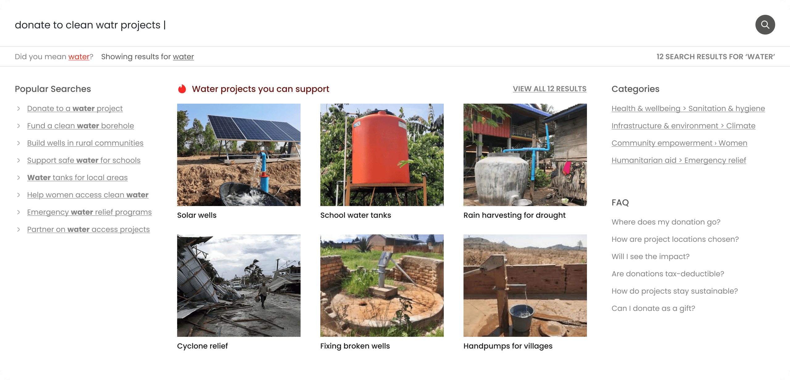
Before results even appeared, users were offered spelling correction, meaningful suggestions, related categories, and live FAQs that answered common questions early. This turned uncertainty into understanding.
Once results were shown, filters were reframed around human values — urgency, funding needed, opportunity type, location, impact scale — helping users choose in ways that aligned with their intentions rather than technical logic.
Each project also included a match score, showing how closely it aligned with users’ needs. This improved scanning, reduced doubt, and supported clearer decisions.
The entire system was designed mobile-first, ensuring accessible, tap-friendly layouts for users on all devices, including those on slower connections.
Together, these updates moved the experience from transactional searching to purposeful discovery — helping people feel confident and informed as they chose a cause to support.


You might find these helpful
A few related articles that build on what you’ve just read.


