Insights
How do confirmation screens improve user trust?
A missing confirmation screen leaves users unsure if their form was submitted. A clear, structured confirmation response reduces anxiety and builds confidence.
Three key methods used in this
insight
When forms leave users in the dark
Many public sector and not-for-profit forms offer no clear confirmation once a user submits their details. Instead of reassurance, users are met with a page refresh or silence. Without feedback, people start wondering if their request was received, whether they need to submit again, or if something went wrong. In moments where clarity matters, this uncertainty creates unnecessary stress.
No confirmation, no confidence
When a form doesn’t give a clear signal that the submission is complete, the experience breaks down.
Users face several common issues:
No success message or visible confirmation
No reference number to track their request
No email copy of what they submitted
No guidance on what happens next
This gap causes frustration, repeated submissions, and extra support calls—adding avoidable pressure to already busy teams.
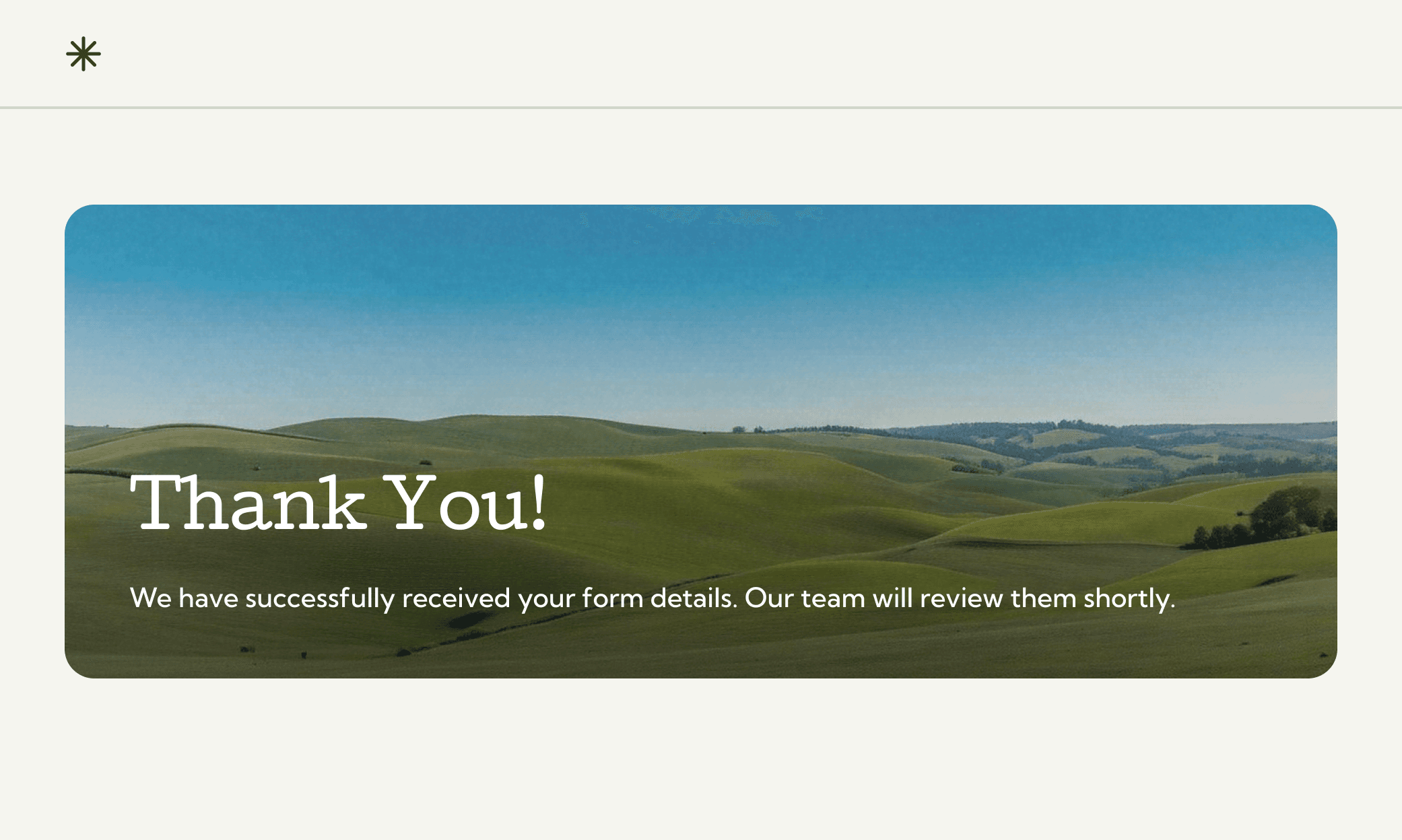
A confirmation screen that reassures and informs
We introduced a confirmation screen designed to remove doubt and give users a clear sense of progress. The structure focuses on clarity, warmth, and practical next steps.
Key elements included:
A personalised message such as “Thanks, Alex. Your request has been received.”
A unique reference number for tracking
A clear timeframe for follow-up, set at “within two business days”
A confirmation email with a summary of the submission
Helpful visual cues such as icons and supportive imagery
A dedicated support number if the user needs help
A friendly sign-off to reinforce trust: “We’ve got it from here.”
This simple improvement reduces anxiety, improves completion confidence, and builds a stronger relationship between the service and the people who rely on it.

You might find these helpful
A few related articles that build on what you’ve just read.


