Free UX resources and templates
How to check if your online form is confusing — and what to fix first
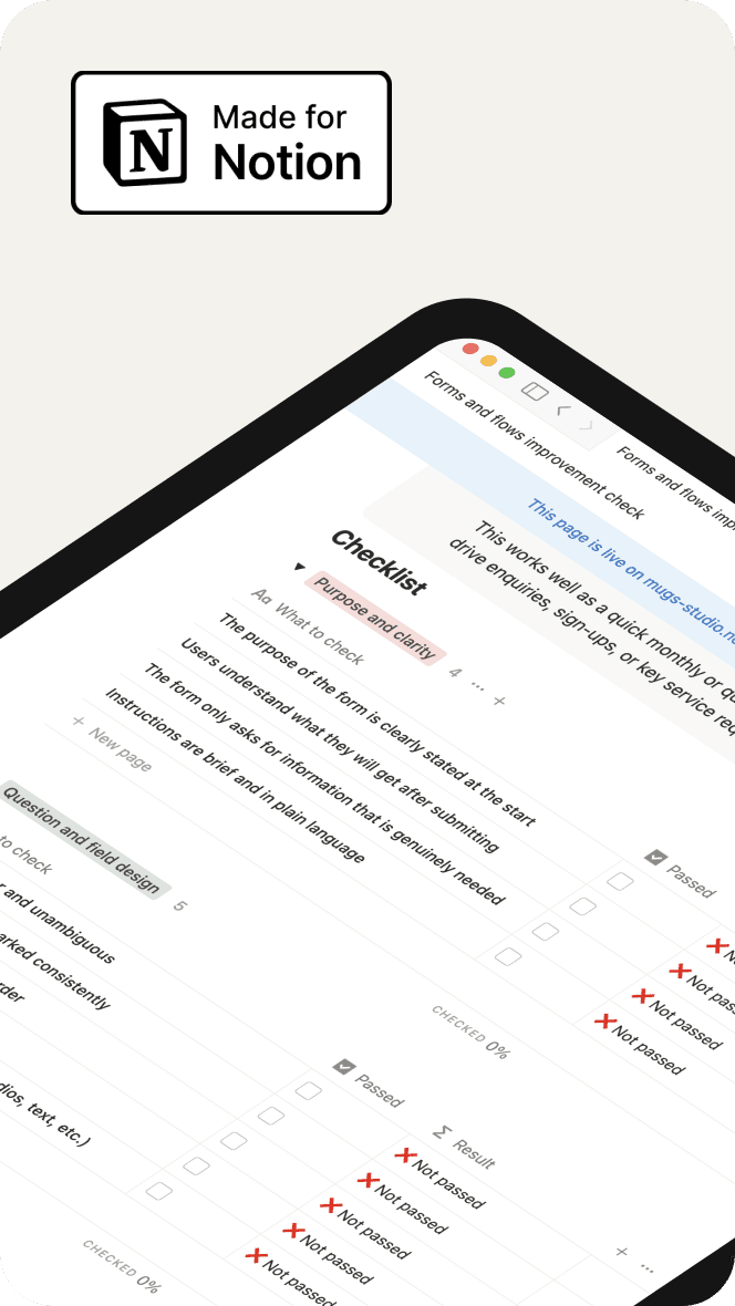
Use this checklist to review any online form and spot unclear questions, broken steps, and accessibility gaps. It helps you see what to fix first to make the form easier to complete.
Why forms often fail users
Run this checklist to review your website’s layout, content, and navigation. Spot small issues early so users can move smoothly through every page.
Small issues add up to big barriers
When questions are unclear, the flow jumps around, or errors don’t help users recover, people get stuck or abandon the form altogether. Long pages, poor mobile behaviour, or missing labels make the experience even harder, increasing support calls and incomplete submissions.
A simple way to review and improve any form
This checklist gives teams a clear, practical way to evaluate their forms step-by-step. It highlights what to fix first — clarity, question design, flow, error messages, accessibility, and mobile behaviour. By working through each section, you can turn a confusing form into one that feels simple, predictable, and easy for people to complete.
File type:
Notion Template
Other resources you may find useful
Browse more free resources designed to help you fix common website issues, reduce confusion, and make your digital services clearer for everyone.