Case Study
Design
An end-to-end design system for a multi-surface digital estate
Designing an end-to-end design system from discovery to handoff
A design system is not a Figma file. It is a set of decisions made in the right order. Here is how one gets built from scratch, end to end.
Three key methods used in this
case study
Visual Design
Design System
Usability Testing

Context
Please note: Connective Care, Highlands Support Co. and Bayside Ability Services are fictionalised organisations created specifically for this case study. They are not real clients. The process documented here reflects genuine methodology applied to a real engagement for a different client in a comparable sector. The scenario has been reconstructed as a conceptual project to demonstrate the end-to-end process without compromising client confidentiality.
Why a design system is the right answer
A design system is not a Figma file. It is not a component library. It is not a documentation site. Those are outputs. A design system is a set of structural decisions made in the right order, decisions about how colour, typography, spacing, components and patterns relate to each other so that teams who were not in the room can build consistently from them.
This case study documents the end-to-end process of building one from scratch. The brief was typical of the kind of engagement in which a design system is the right answer. A post-merger organisation, Connective Care, formed from the merger of two regional NDIS providers, was operating across five disconnected digital surfaces. Two legacy websites, a participant-facing portal, a mobile app and a staff intranet, each built at different times by different teams, each reflecting a different visual language. A new brand identity existed, but had not been translated into a digital system. Two legacy codebases ran in parallel. Vendors were receiving conflicting briefs. Staff were recreating assets from memory. None of this was unusual. All of it was solvable, but only with a system, not a series of visual fixes.
The audiences that had to be served made the problem more acute than it might be for a retail brand. Participants managing complex care needs. Family members acting as advocates. Support workers in the field. Funding bodies assessing organisational credibility. Accessibility was not a feature; it was a foundation-layer requirement from the start.
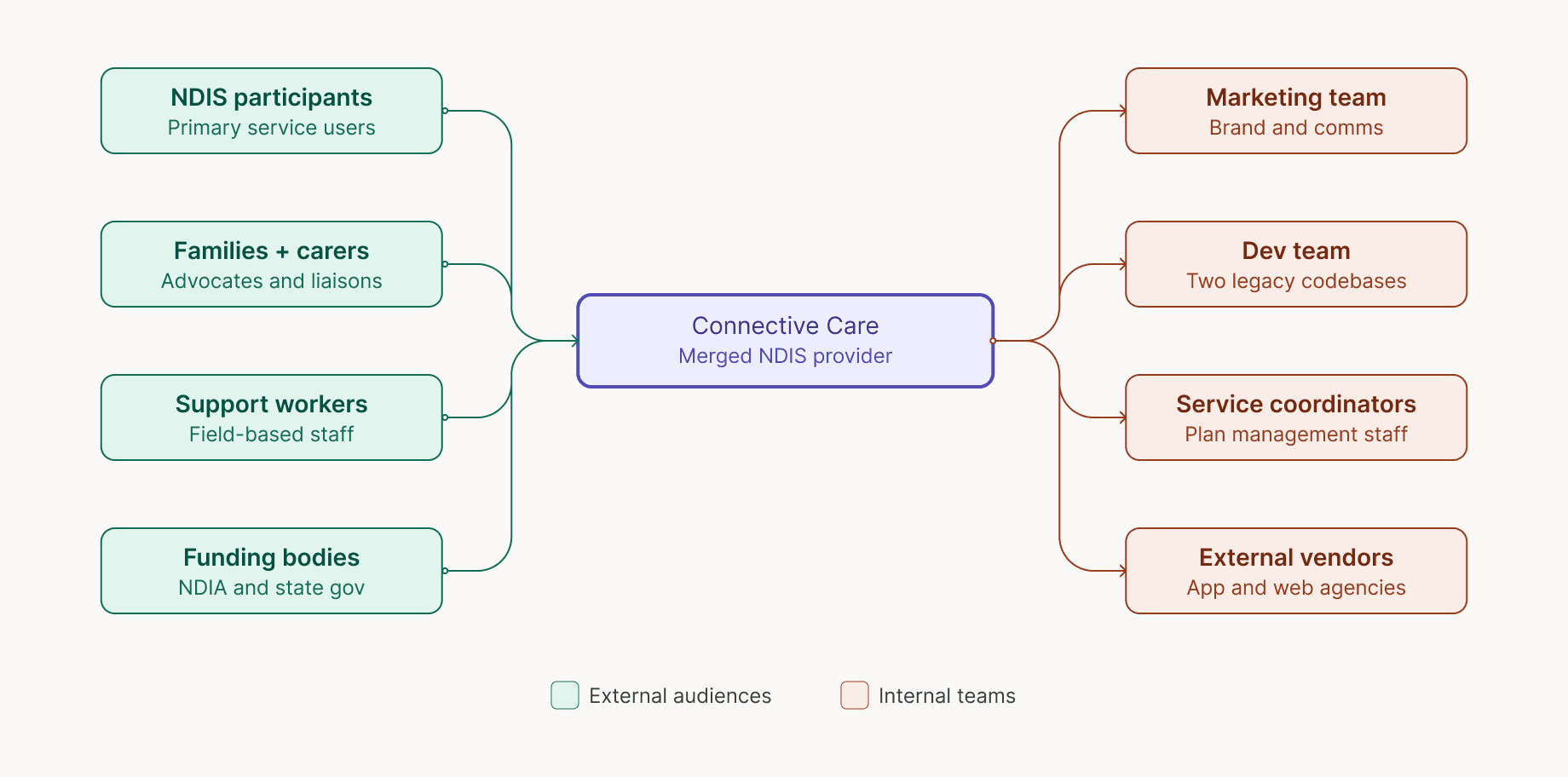
Phase 1: Stakeholder mapping
Every person who would be affected by the digital system was mapped before any design work began. Eight distinct stakeholder groups were identified:
Four external audiences and four internal teams. Understanding who would use the system, who would build from it, and who would maintain it directly shaped every structural decision that followed. This is the step most projects skip, and most projects regret.
Phase 2: Discovery workshops
Three workshops across two weeks with 24 participants surfaced four distinct problem clusters: brand fragmentation, accessibility failures, a fractured technology stack and a team operating without shared standards. The clusters reinforced each other. The brand could not be fixed without tokens. Accessibility could not be fixed without a component library. The team problem would not be resolved until there was a single source of truth for everyone to work from.
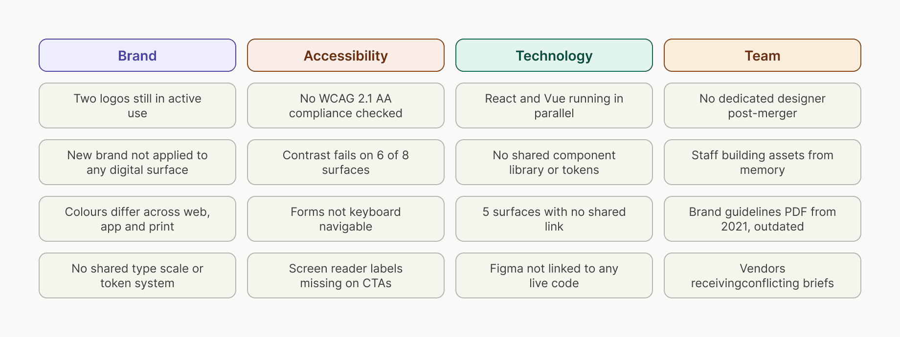
Problem
What the audit actually revealed
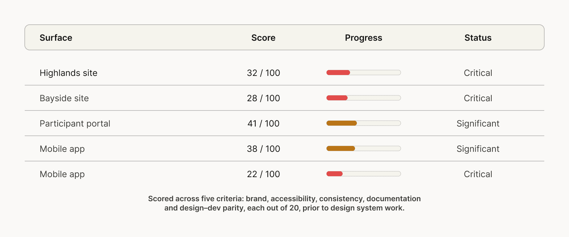
Discovery surfaces feelings. An audit surfaces facts. Before any design work was scoped, every digital surface was catalogued and scored across five criteria — brand alignment, accessibility compliance, component consistency, documentation quality and design–development parity.
Phase 3: Digital surface audit
No surface scored above 41 out of 100. The weakest score, 22, for the staff intranet reflected a surface with essentially no brand, structure, or documentation. The strongest score, 41, for the participant portal reflected something functional but unbranded. These were not scores that could be presented to a board as a minor remediation job. They were scores that made the case for a system-level response.
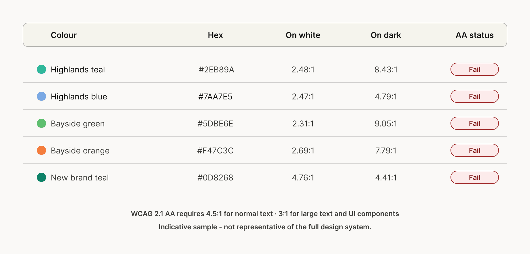
Phase 4: Accessibility audit
The accessibility picture was the most urgent. A full colour contrast audit of the legacy brand colour sets found that every primary colour from both Highlands and Bayside failed WCAG 2.1 AA requirements for normal text on white backgrounds. The new brand teal at #0D8268 achieved 4.76:1 against white, above the 4.5:1 minimum, providing a measurable basis for the accessibility argument for the rebrand. The new identity was not just visually better. It was demonstrably more accessible than what it replaced.
Phase 5: Problem framing
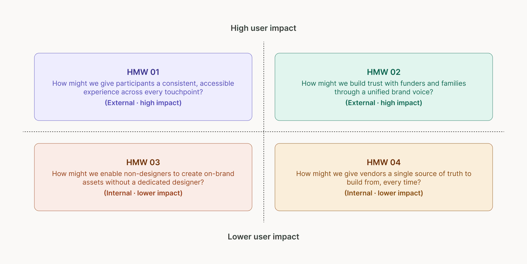
With discovery and audit complete, findings were synthesised into four "how might we" questions. These became the standing evaluation criteria for every subsequent design decision.
How might we give participants a consistent, accessible experience across every touchpoint? How might we build trust with funders and families through a unified brand voice? How might we enable non-designers to build on-brand assets without a dedicated designer? How might we give vendors a single source of truth to build from, every time?
The first two carry the highest direct impact on the people the organisation exists to serve. The second two are primarily internal, but they determine whether the system is actually used and maintained after handoff. A design system that no one can confidently build from is not a design system. It is a document.
Solution
Building the system in the right order
The most common failure mode in design system projects is starting components before tokens are stable, and starting patterns before components are proven. The sequencing here was deliberate, nothing from an upper layer was touched until the layer beneath it was locked.
Phase 6: System architecture
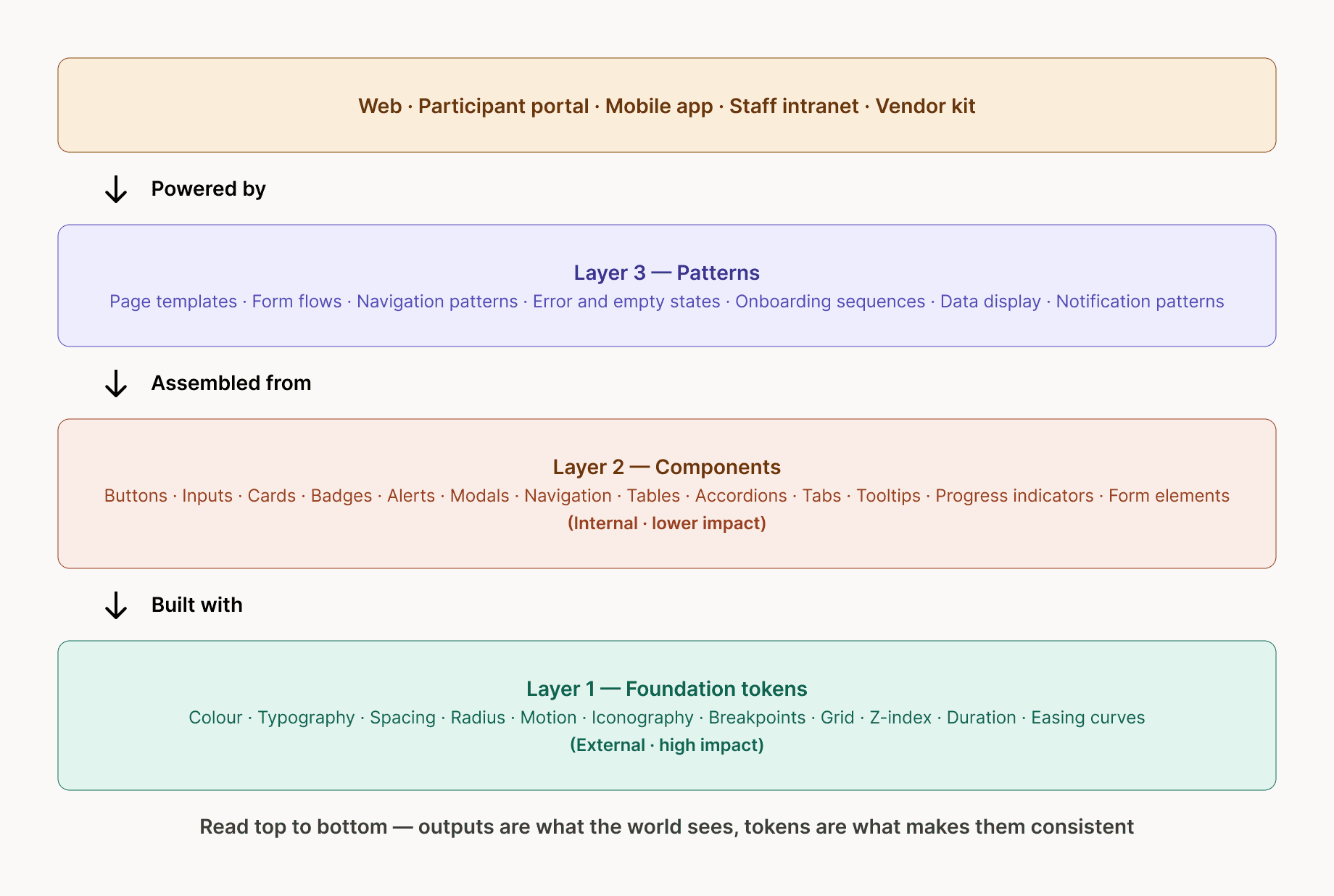
The system was structured across four tiers. Outputs at the top, the five digital surfaces the world actually sees. Patterns below, assembled from components to build those outputs. Components below that are built from tokens. Foundation tokens at the base, the layer on which everything else depends. Reading the architecture top to bottom gives you the dependency chain. Reading it bottom to top gives you the build order.
Phase 7: Foundation tokens
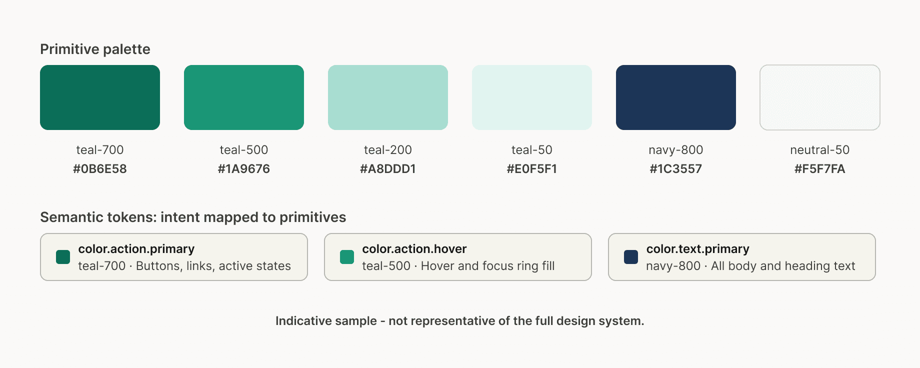
The token system was the first deliverable and the most consequential. A two-tier architecture was established. Primitive tokens defined the raw palette. Semantic tokens mapped intent to those primitives — color.action.primary pointed to teal-700, color.text.primary pointed to navy-800, color.surface.tint pointed to teal-50. The key principle is that a future rebrand becomes a single token swap across every surface simultaneously, rather than a find-and-replace exercise across an entire codebase.
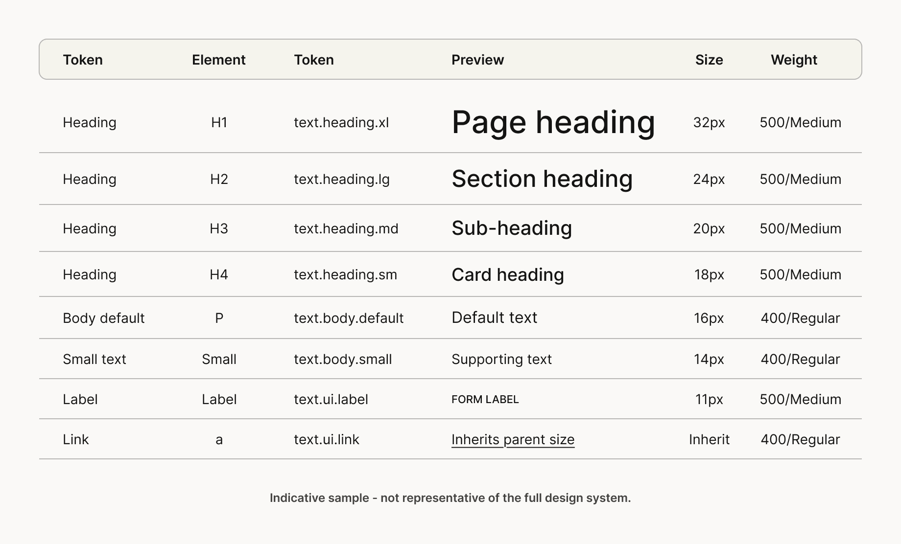
Typography tokens followed the same structure. Eight styles mapped to real HTML elements, h1 through h4 for heading hierarchy, body default and small for paragraph content, label for form fields and eyebrows, link for inline anchors. Weights were deliberately limited to regular and medium. An organisation serving people navigating complex or stressful situations should feel clear and approachable, not heavy.
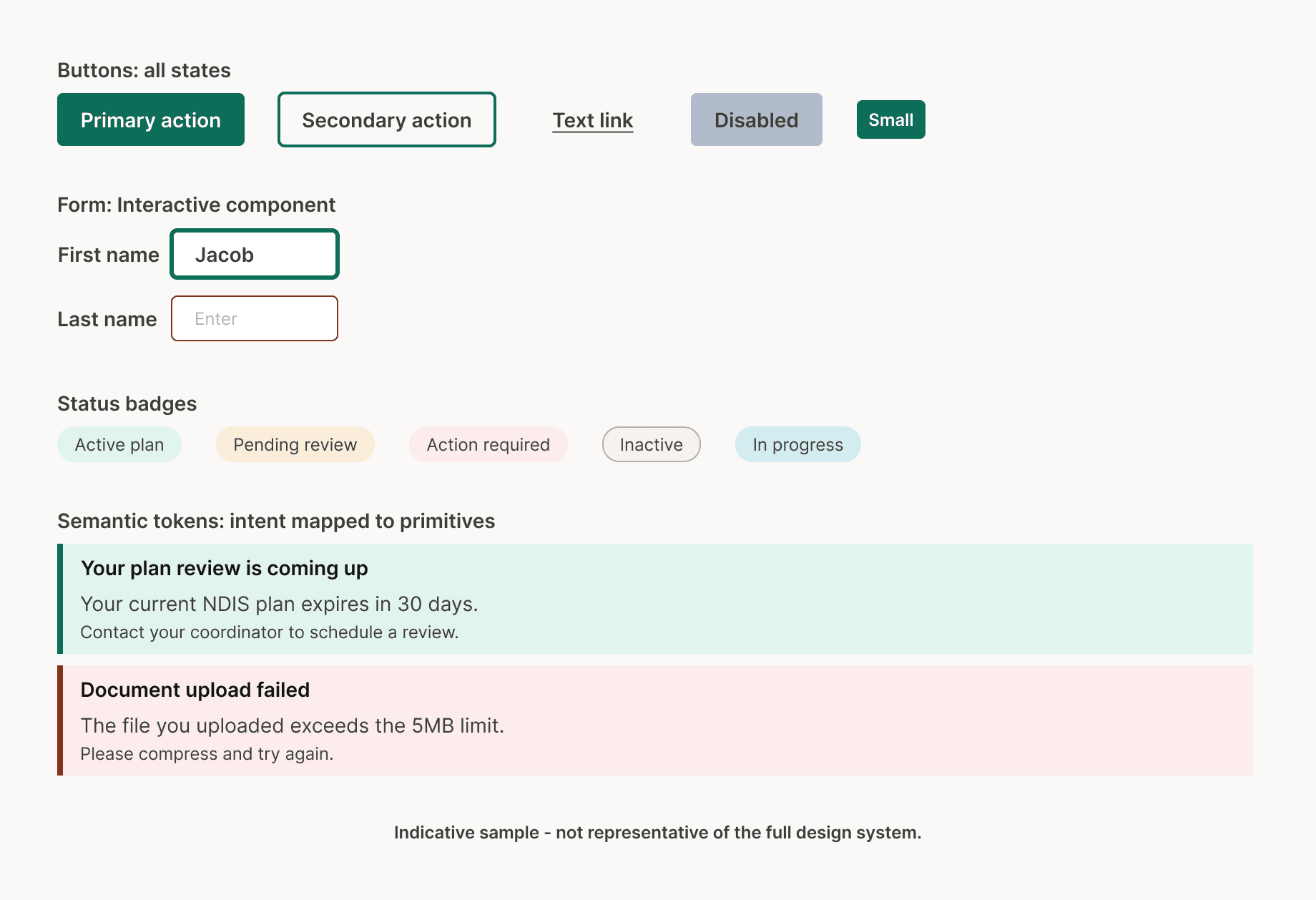
Phase 8: Component library
With the token system locked, 120+ foundation components were built across five categories: interactive elements, form elements, feedback elements, navigation elements and layout elements. Every component was built with all states documented, default, hover, focus, active, disabled and error, before being marked complete. Every interactive element was verified for keyboard navigability and screen reader compatibility.
The focus-state treatment warrants specific mention. Visible, high-contrast focus rings are one of the most commonly removed elements in design work. They are invisible to mouse users and often get cut in review because they "look cluttered." For keyboard and screen reader users, they are essential. Every interactive component in the library uses a 3px teal focus ring meeting contrast requirements on both white and tinted backgrounds. This was a deliberate accessibility decision, not an aesthetic one.
Phase 9: Typography system
The typography scale codified the full text hierarchy, heading levels mapped to HTML elements, body and supporting styles, and UI-specific styles for labels and links. Every style carried a token name that developers could reference directly. The discipline of limiting to two weights and documenting line heights explicitly meant that text rendering remained consistent across every surface, regardless of which team built it.
Phase 10: Participant portal pattern
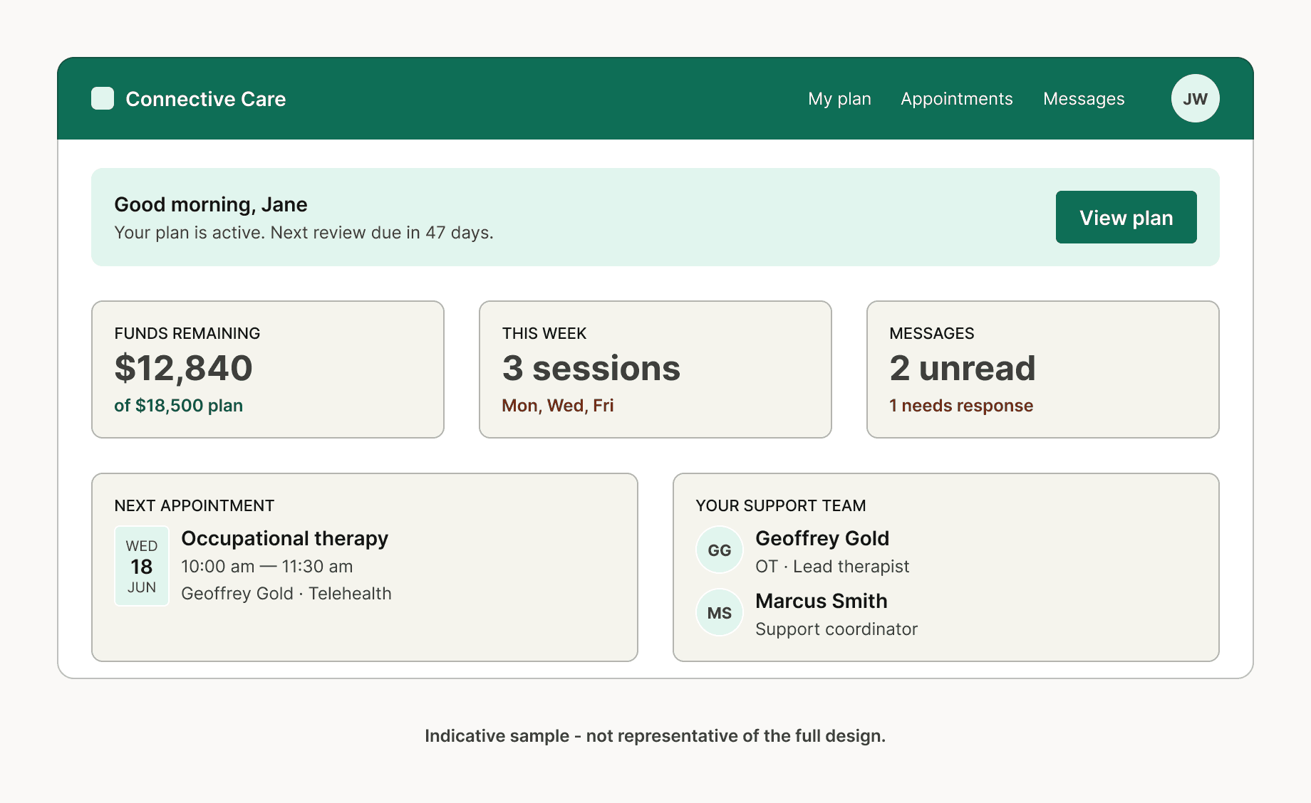
With components stable, they were assembled into full interface patterns. The participant portal dashboard is the clearest expression of the system working as intended: a single surface that brings together plan status, remaining funds, upcoming appointments, and the support team, built entirely from the component library within the token system, and fully accessible.
What this pattern represents is not just a well-designed screen. It is proof that the layers beneath it work. Every colour traces back to a token. Every interactive element follows a component specification. Every piece of text sits within the scale. A vendor building a new screen can reference this pattern, pull components from Figma, and produce something consistent without making those foundational decisions themselves.
Phase 11: Outcomes and impact
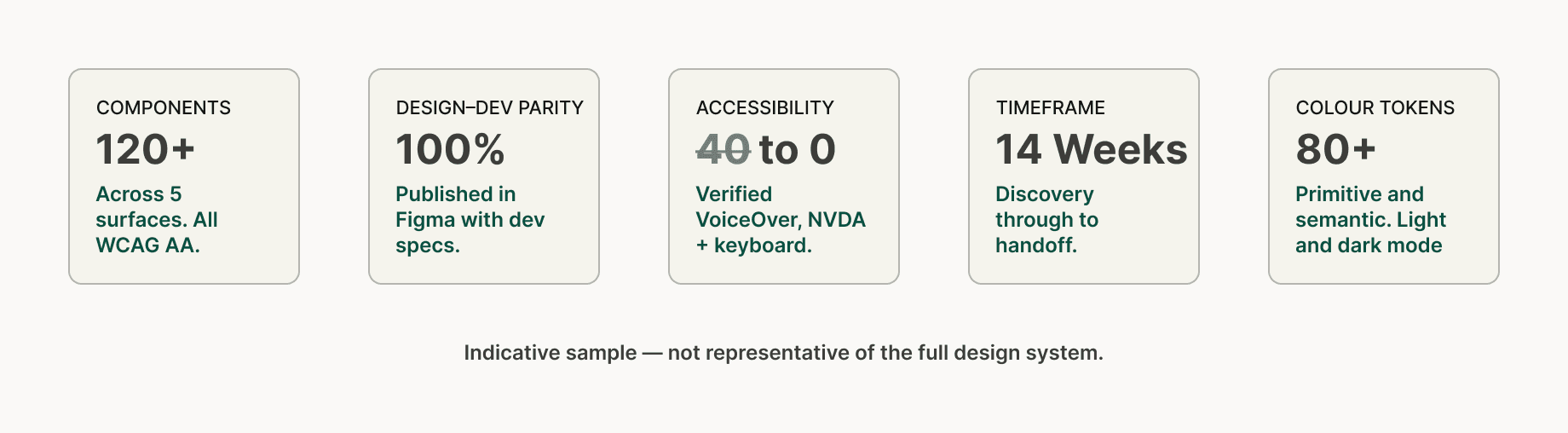
The accessibility story is the most significant. At the start of the project, 24 distinct failures were documented across the five surfaces. Everyone was resolved by completion. All foundation components passed WCAG 2.1 AA verification through automated tooling, manual keyboard testing and screen reader review using both VoiceOver and NVDA.
The phase one foundation delivered 120+ components, 80+ colour tokens across primitive and semantic tiers covering light and dark mode, 100% design–development parity through Figma components with dev specs, a single vendor quick-start guide that replaced the conflicting briefs previously being issued, and a complete pattern library covering the three primary user flows. The system was built to scale. Subsequent phases extend components, patterns and token coverage.
What this project demonstrates
This case study is a conceptual reconstruction, but the process it documents is real. The methodology, stakeholder mapping before discovery, audit before framing, tokens before components, components before patterns, documentation as a deliverable, not an afterthought, is the same process applied to live engagements in comparable sectors.
What it shows is that a design system is not primarily a Figma file or a component library. It is a set of decisions made in the right order, documented in a way that allows teams who were not in the room to build consistently from them. The work that matters most happens before a single frame is opened, in the workshops, in the audit, in the framing sessions and in the structural decisions about how tokens relate to components and how components relate to patterns. If those foundations are right, everything else follows from them. If they are not, no amount of craft at the component level will compensate.