Case Study
Design
Helping tradies trust AI bookkeeping without checking every line
Sector:
Small business finance
Timeline:
8 weeks
Designing trustworthy AI for a bookkeeping app
How I designed trustworthy AI for Plumbtally, a concept bookkeeping app for tradies, so people review the lines that matter instead of checking every one.
Three key methods used in this
Interaction & Flow Design
Content Design
Prototyping

The context: an AI bookkeeping app tradies didn't trust
Concept project. Plumbtally is a fictional product, not a real client, created for concept purposes only. All names, figures and screens use sample data.
Plumbtally is an AI bookkeeping app for Australian tradies and sole traders. You photograph a receipt or forward an invoice. The AI reads it, matches it to a bank transaction, picks a category, sets the GST code and drafts the quarterly Business Activity Statement (BAS). This concept explores how to design trustworthy AI: an app people check less because it shows more.
Who it's for
Electricians, plumbers, carpenters and cleaners who do their books on a phone, in the ute, between jobs. Most leave the whole quarter to one sitting, a week before the BAS is due.
The problem to solve
The AI was right most of the time, but nobody acted like it. People checked every line by hand, so an app built to save time saved none. After one visible mistake, they stopped trusting any of it.
Requirements
Show what the AI did and why, in plain words.
Point people to the lines they need, and let them skip the rest.
Make every AI action reversible until the BAS is lodged.
Hand over to a human bookkeeper when the AI is out of its depth.
Design for the AI being wrong, not only for when it's right.
Work one-handed on a phone, in five-minute gaps.
The goal: calibrated trust
An app that trains people to accept everything will eventually get them to accept a wrong GST claim. The goal was calibrated trust: accept what's right and catch what's wrong, as Google's People + AI Guidebook recommends.
My role
Solo concept. I framed the problem, mapped the AI's decisions, wrote the interface content, designed the screens and built a coded prototype with AI.
The pain points: why people checked every line the AI touched
I started with my own books. I run a small company and prepare my own BAS, so I know the quarter-end worry about one wrong line. Public app store reviews of AI receipt and bookkeeping apps raised the same six pain points.
Everything looked equally certain
A $4.50 coffee and a $1,905.23 tool purchase sat in identical rows. With no signal of where the risk was, the only safe option was to check everything.

Decisions came with no reasons
A row said "Materials" and nothing else. People can't check a decision they can't see, so they redid it from scratch.
One mistake undid all the trust
A single visible error made people doubt the other 59 lines. Researchers call this algorithm aversion: we forgive a person's mistake faster than a machine's.
Fixing things felt risky
Editing a line gave no sign of what else changed, no undo and no preview of the effect on the BAS. With the ATO at the other end, people froze.
The AI guessed what only the user knew
The AI can read a receipt. It can't know whether a $418 Bunnings run was for a job or the back garden. It guessed, and showed the guess as fact.
Help meant starting again
When unsure, the only option was "Contact support". People exported a spreadsheet and emailed their bookkeeper, doing the work twice.
The root cause: the AI hid its reasoning, its doubt and its mistakes, so people assumed the worst.
The solution: explainable AI that shows its work
The redesign gives the AI a visible record, labels its doubt, queues what needs a person and keeps a bookkeeper one tap away. Seven steps got it there.
1. Map every decision the AI makes
Before any screens, I listed each decision the AI makes, what a wrong answer costs and whether the user could spot it. A wrong category on a $9 purchase barely matters. A wrong GST code on a $2,000 purchase flows into the BAS, and people rarely spot it. That map set the design priorities.
2. Show what the AI did, and why
The home screen became a feed of the AI's actions, each with a one-line reason that points to evidence people can check:
"Matched to your card payment on 12 Aug. Same amount, same day."
"Coded as materials. You've coded 22 Rexel purchases this way."
Each entry is tagged as the AI's action or yours. A good reason lets someone verify a decision in two seconds. "Confidence 0.87" (Confidence score, which indicates an 87% probability or certainty that a specific prediction, classification, or data output is correct) doesn't.

3. Label confidence with an action
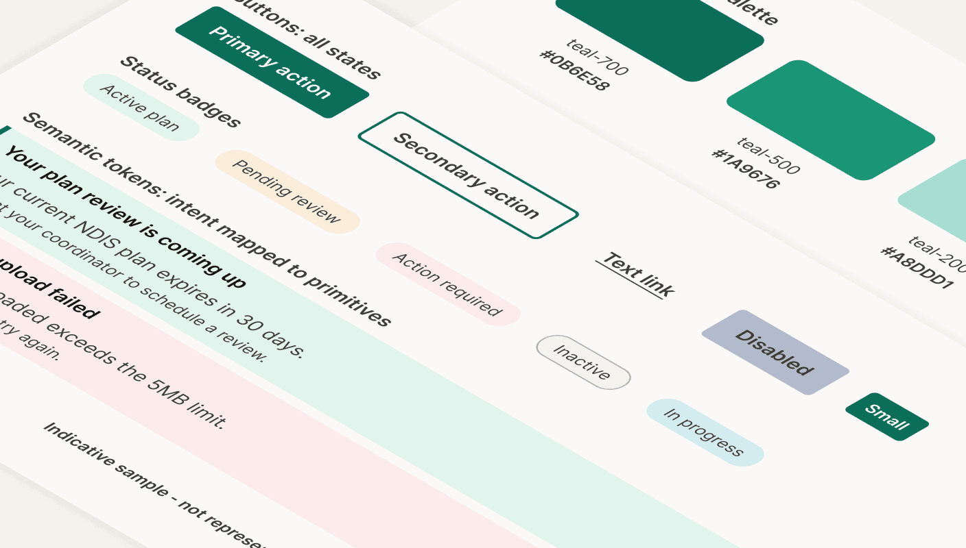
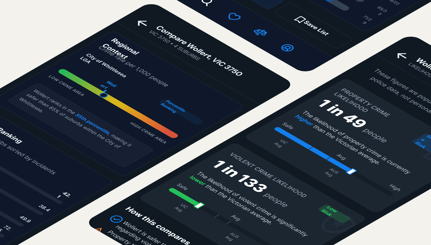
Percentages look precise but don't say what to do. As in my suburb safety concept, the job was turning numbers into something people can act on. I used three labels: Sorted (nothing to do), Worth a look (probably right) and Needs you (only you know). Labels weigh confidence against stakes, so the same doubt is Sorted on $9 and Needs you on $2,000. Each pairs an icon with text, so meaning never relies on colour.
4. Build a review queue sorted by impact
Anything not Sorted goes into a queue, ordered by its effect on the BAS. The home screen says "7 to check, about 4 minutes." Each card asks one question in the words of doubt: "Was this for work or personal?" or "Is the total $68.00 or $86.00?"

5. Make every action reversible
Every AI action can be undone until the BAS is lodged. Changing a line shows the effect straight away: "GST credits: $1,842 to $1,804." When someone corrects the AI, it asks before learning from the fix.

6. Design the "AI got it wrong" state first
I designed the error state before the happy path, because it decides whether one mistake costs one line of trust or all of it. The app owns the mistake plainly, shows the effect on the BAS and checks for the same error elsewhere: "2 other purchases were coded the same way. Review them?"

7. Keep a human bookkeeper one tap away
From any line, or the whole BAS, people can ask a registered BAS agent. The request carries the receipt, the AI's reasoning and the user's note. The AI also suggests the handover itself when a question is beyond it, such as a possible capital purchase.

Prototyped with AI, and saying so
I designed the screens in Claude Design and built a coded prototype with Claude Code. I wrote the decision map, content, confidence rules, and test data. The AI wrote the front-end code from that spec, and I reviewed and fixed what it got wrong. Code beat a static mock-up because trust builds over a sequence.

How I'll measure success
Testing compares the old flat list with the redesign, using a quarter of sample data with five planted AI mistakes.
AI suggestions accepted without edits should rise.
Time to review a quarter should fall.
Planted mistakes caught should also rise, so higher acceptance can't hide blind trust.
What makes an AI feature people can trust
Give a reason that points to evidence.
Label doubt with an action, not a percentage.
Weigh confidence against what's at stake.
Make every action reversible, and show the consequence.
Design the wrong state first, and keep a human close.