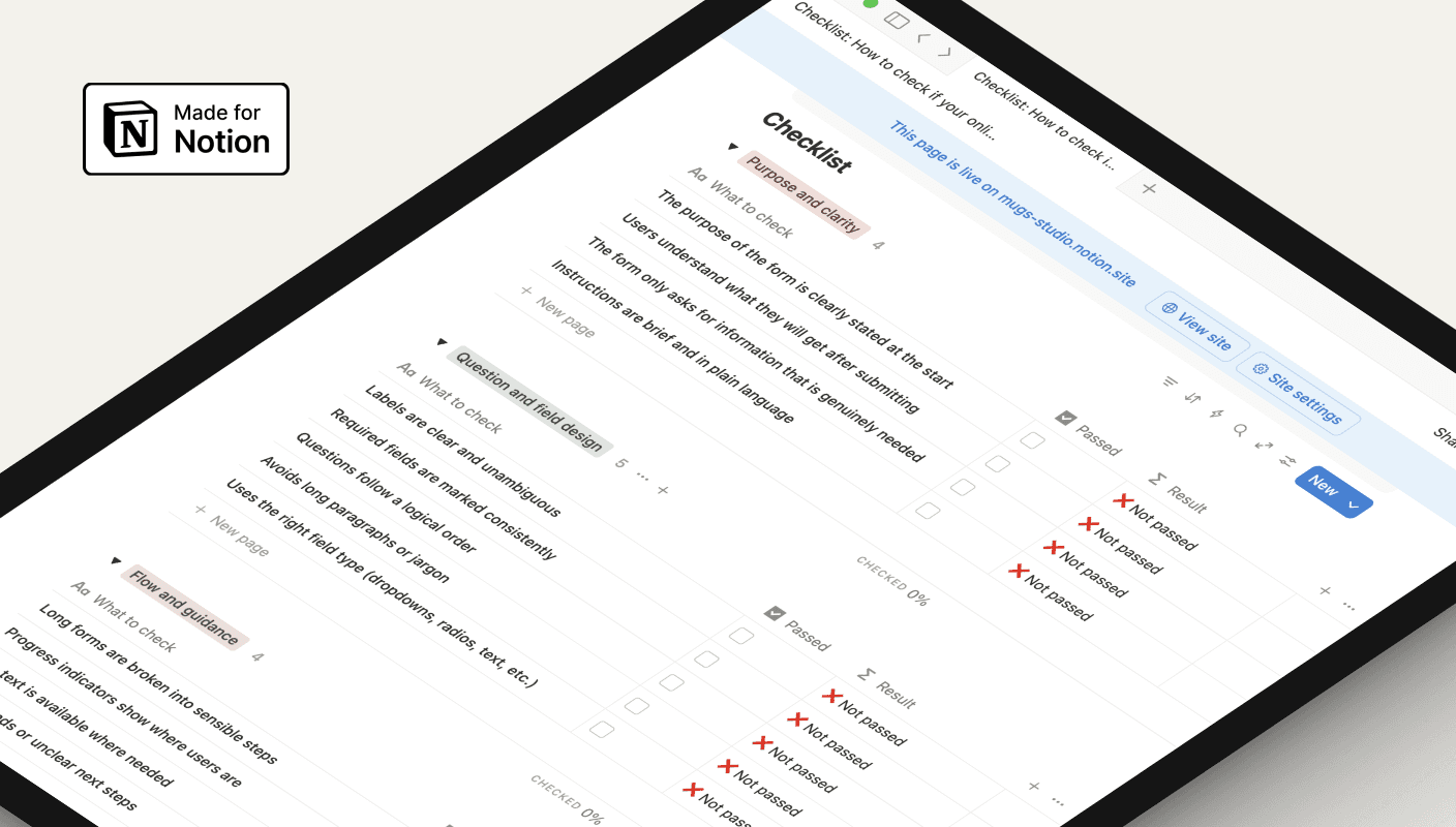
Checklist

Template

Is your online form losing people before they finish?

How to check if your online form is confusing and what to fix first

Use this checklist to review any online form and spot unclear questions, broken steps, and accessibility gaps. It helps you see what to fix first to make the form easier to complete.

Three key methods used in this

notion screen shot

Why forms often fail users

Online forms are a key part of most services, yet they’re often built quickly, copied from old versions, or shaped only by internal needs. This makes it easy to overlook clarity, structure, and accessibility — and users feel the impact when forms become slow or confusing.

Small issues add up to big barriers

When questions are unclear, the flow jumps around, or errors don’t help users recover, people get stuck or abandon the form altogether. Long pages, poor mobile behaviour, or missing labels make the experience even harder, increasing support calls and incomplete submissions.

A simple way to review and improve any form

This checklist gives teams a clear, practical way to evaluate their forms step-by-step. It highlights what to fix first — clarity, question design, flow, error messages, accessibility, and mobile behaviour. By working through each section, you can turn a confusing form into one that feels simple, predictable, and easy for people to complete.

You might find these helpful

UI form design

Public Housing · Victorian Government

Helping public housing residents report repairs without calling

Redesigned a broken digital form so 50,000 residents could self-serve with confidence

Case Study

A dark-themed app interface for Suburb Check

Real estate & public safety · Concept

Making suburb safety data useful for people choosing where to live

Turned overwhelming crime statistics into calm, contextual insights on a mobile screen.

Case Study

Hero section of website with family

UI concept · Information architecture

Redesigning a council website so residents can find what they need

A UI concept exploring how to reduce call volume by making local services easier to find.

Design

UI form design

Public Housing · Victorian Government

Helping public housing residents report repairs without calling

Redesigned a broken digital form so 50,000 residents could self-serve with confidence

Case Study

A dark-themed app interface for Suburb Check

Real estate & public safety · Concept

Making suburb safety data useful for people choosing where to live

Turned overwhelming crime statistics into calm, contextual insights on a mobile screen.

Case Study

Copyright © 2026 Mugs Studio Pty Ltd. All rights reserved

Copyright © 2026 Mugs Studio Pty Ltd.

Copyright © 2026 Mugs Studio Pty Ltd. All rights reserved