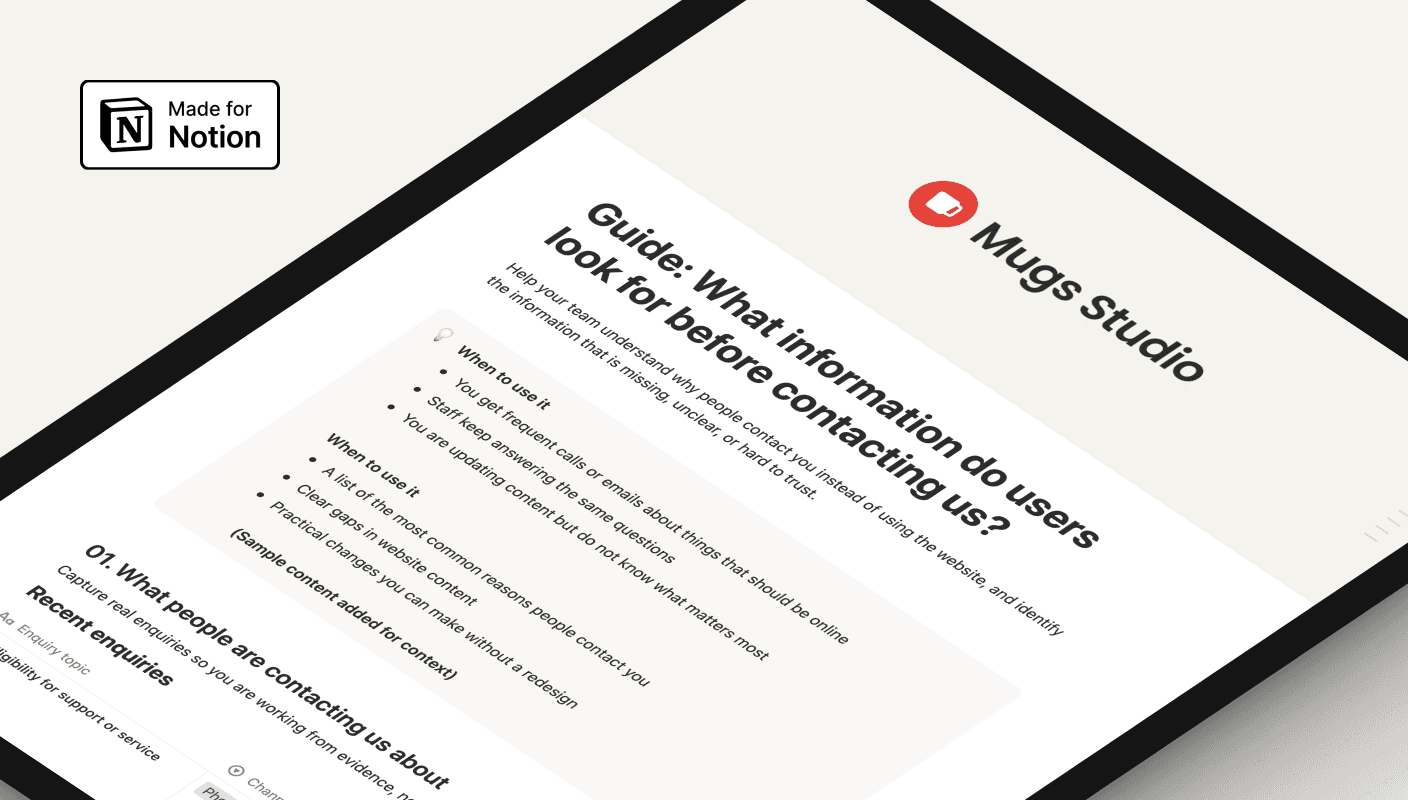
Guide
Template
What do users need to see before they feel confident enough to act?
What information do users look for before contacting us?
Users often contact you to confirm details, not because they are stuck. Learn what information people look for first and how to surface it clearly.
Three key methods used in this
What users want to know before they reach out
Most users do not contact an organisation as their first step. They visit the website first to confirm they are in the right place and that it is safe to continue.
At this point, users are not confused yet. They are deciding. They want to know if a service applies to them, what is expected of them, and what will happen after they take the next step.
This moment is easy to overlook because it happens quietly. Users are scanning pages, looking for reassurance rather than instructions. When they find it, they move forward. When they do not, they pause.
Contact often happens at this pause point. It is not always a sign that the website is broken. More often, it signals that the website did not answer a key question clearly enough for users to feel confident continuing on their own.
Understanding this early decision-making stage helps explain why people reach out even when information technically exists online.
The website does not support early decisions
Many websites contain the right information, but not in a way that helps users make a clear decision.
Details are often written too broadly or buried in lengthy explanations. Important information appears halfway down a page, after users have already started to doubt themselves. Next steps are implied rather than stated. Confirmation screens focus on completion, not reassurance.
When this happens, users are left with uncertainty. Rather than guessing, they choose the safer option and contact your team.
Over time, this creates a familiar pattern. Staff answer the same questions repeatedly, and users rely on contact as a way to confirm they are doing the right thing. The website becomes a reference point, not a guide.
When users contact you to double-check information, it is tempting to immediately update pages or rewrite content. Before doing that, it helps to clearly define what the underlying problem actually is. How to clearly define website problems before changes? It is a free guide that shows how to capture the issue properly, separate symptoms like repeat enquiries from the real cause, and focus on the right improvements instead of guessing.
Surface reassurance and clarity earlier
Reducing unnecessary contact does not require a redesign. It requires identifying what users need to know before they act and making that information easier to find, understand, and trust.
Start by reviewing common enquiries and listening for questions that signal uncertainty rather than confusion. These are often questions about eligibility, timing, or next steps.
Next, check where this information appears on the website. In many cases, it already exists but is placed too far down the page, written in internal language, or missing key details users are looking for.
Small changes can have a meaningful impact. Adding a short “before you start” section that clearly states who the service is for, or explains what happens after a form is submitted, can eliminate the need for contact.
Using the same wording people use when they contact you also helps. When users see their own questions reflected on the page, their confidence increases and their hesitation decreases.
The goal is not to add more content, but to make the right information visible when users are deciding whether to continue.
How does this help over time
When users can confirm key details early, they are more likely to proceed without contacting you. This reduces repeat enquiries, frees up staff time, and creates a calmer experience for everyone involved.
Over time, the website becomes something users trust to guide them, not something they need to double-check. Clear information supports better decisions, fewer interruptions, and smoother online journeys.