Case Studies
How to redesign a confusing visa application to be clear
A complex visa form can overwhelm users and erode trust. This redesign shows how a guided, step-by-step journey makes the process clearer, safer, and easier to complete.
Three key methods used in this
case study
Why this redesign was needed
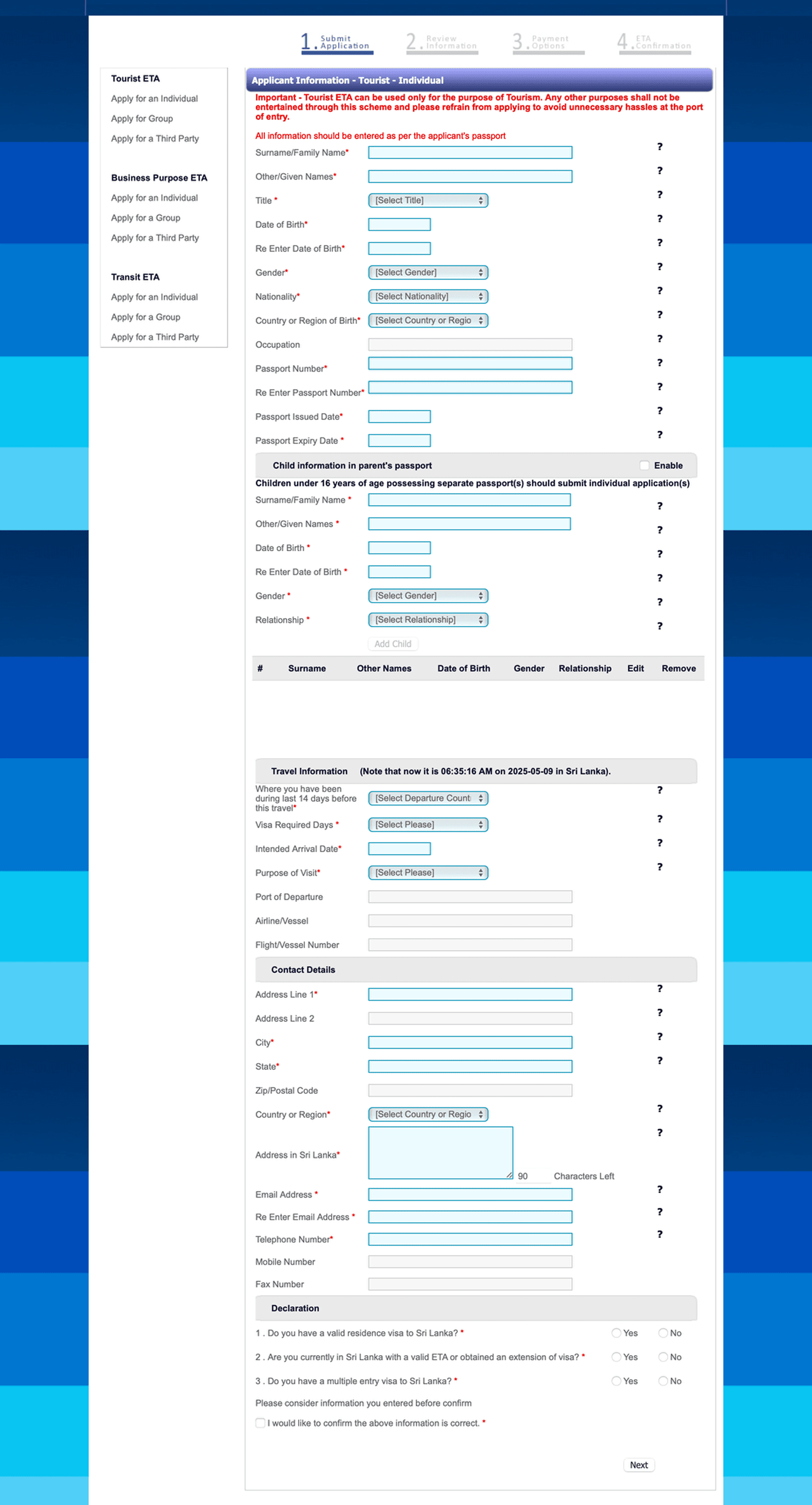
The Sri Lankan ETA visa application was used as a conceptual example to explore how outdated, unstructured forms create unnecessary barriers. The original flow relied on a single long page, weak visual hierarchy, and no meaningful guidance. Combined with its dated interface and lack of accessibility, the experience felt overwhelming and raised doubts about security and legitimacy—especially for international users completing the form on mobile.
What made the original form confusing
The previous design made it hard for users to trust the process and complete the application accurately. All fields appeared at once, with no logical grouping or clear starting point. Eligibility checks came at the end, meaning users could spend several minutes entering details only to learn they didn’t need a visa. Labels doubled as placeholder text, error messages lacked clarity, and the layout wasn’t mobile-friendly. The payment step felt disconnected and unclear, and the confirmation screen offered no reassurance that the submission was complete and secure.
Key issues included:
Overwhelming single-page layout with no navigation
No upfront eligibility screening
Poor section grouping and unclear labels
Low readability and weak guidance
No mobile optimisation
No progress indicator or step count
Missing accessibility standards
No review step before submission
Outdated and unclear payment flow
Generic, unhelpful confirmation message
Forms often fail when too much is asked at once or instructions are unclear. If this sounds familiar, how do I fix confusing forms? Explains what to look for and how to improve forms without starting from scratch.
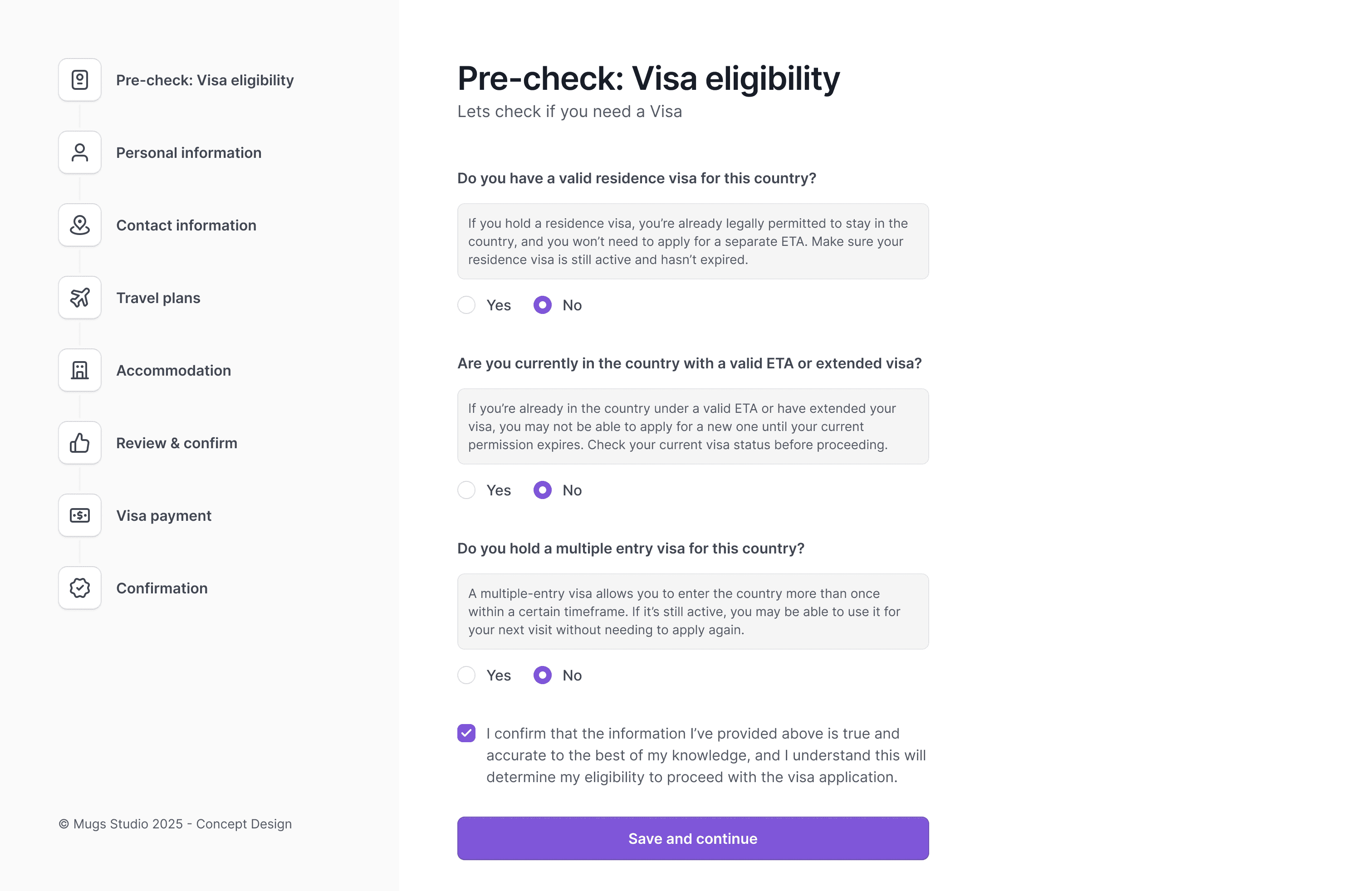
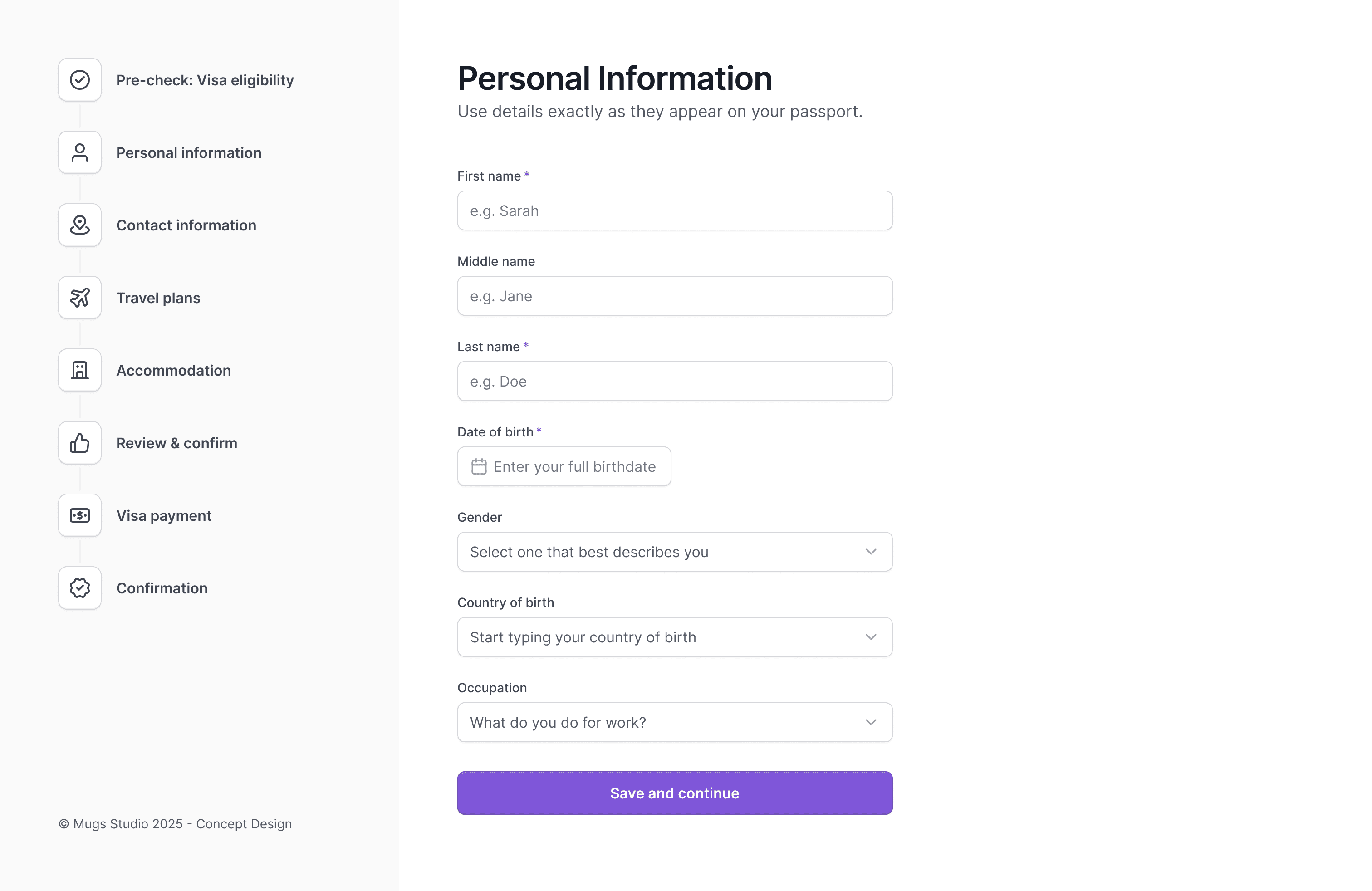
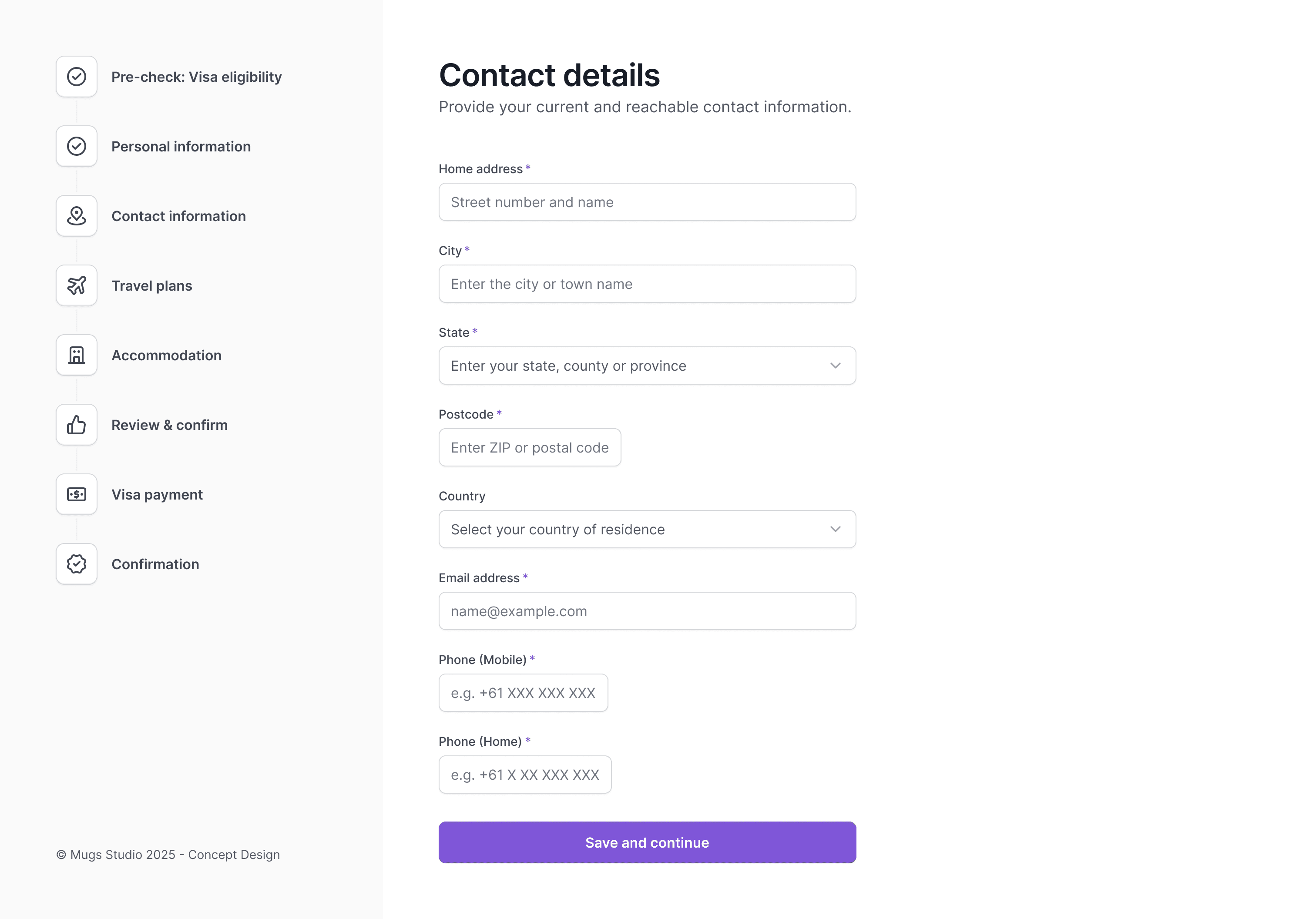
How the redesigned journey improves clarity and trust
The new design restructures the entire process into a clear, guided journey built on trust, simplicity, and accessibility. By breaking the form into digestible steps—and placing eligibility checks at the start—users now move through the application with confidence. Visual progress indicators, purposeful hints, and clear section labels help reduce cognitive load, while accessible patterns ensure everyone can interact with the form easily.
Improvements include:
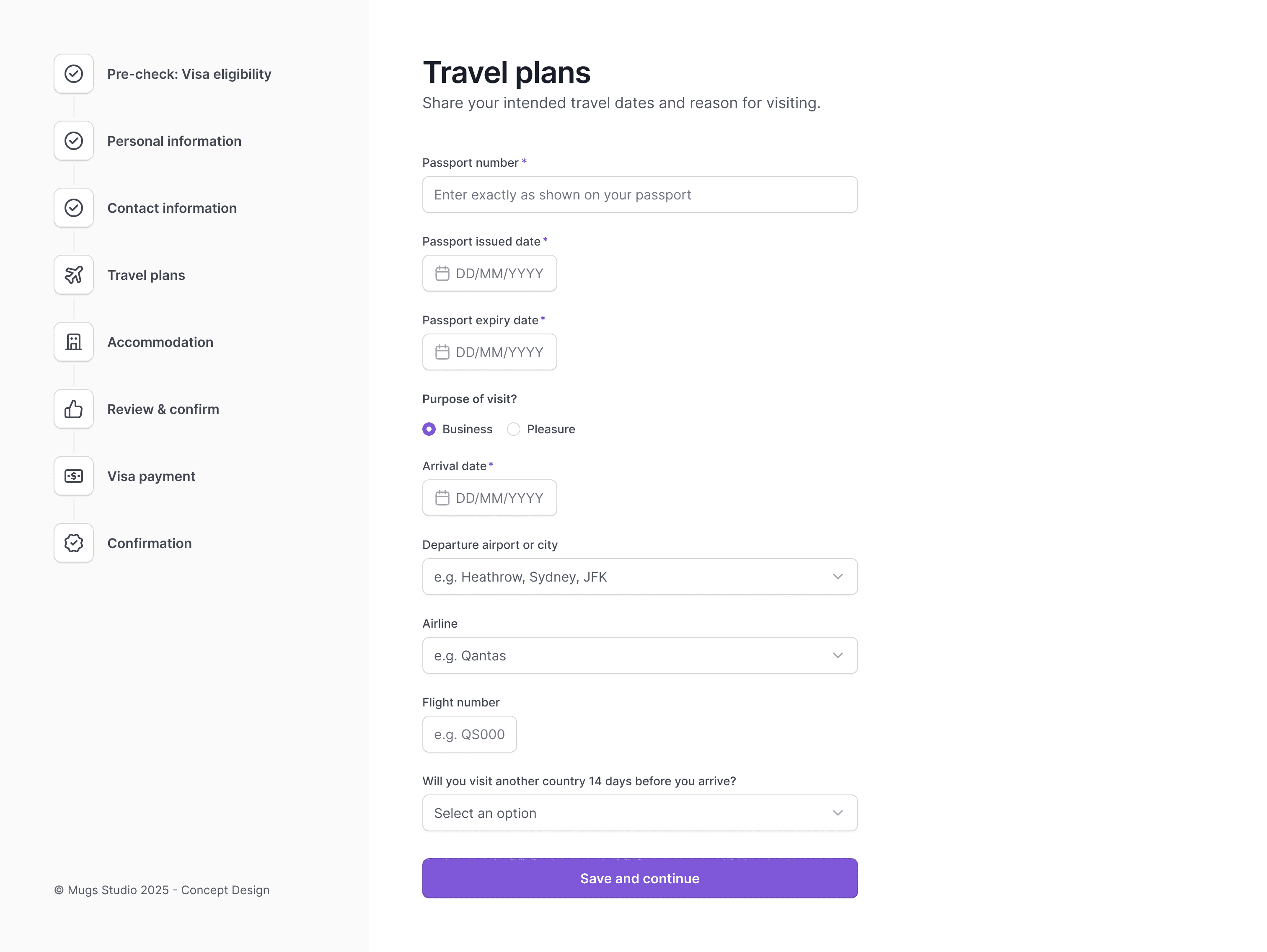
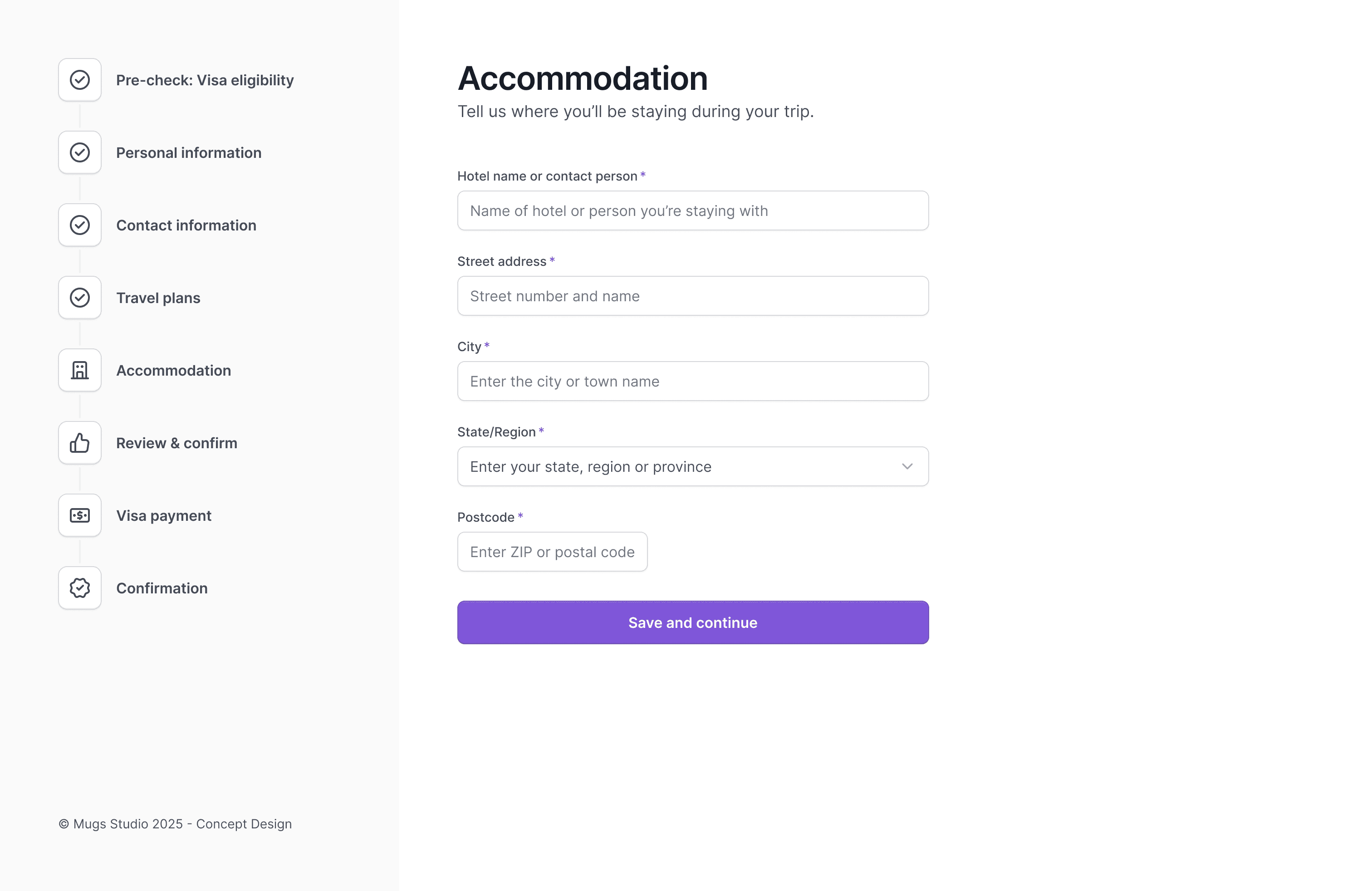
A guided step-by-step structure to replace the long, cluttered page
Eligibility questions are placed up front to prevent wasted time.
Clear grouping of personal, travel, contact, and payment details
Improved typography, spacing, and field guidance
Fully responsive layout for mobile and tablet
WCAG-aligned interaction states and form accessibility
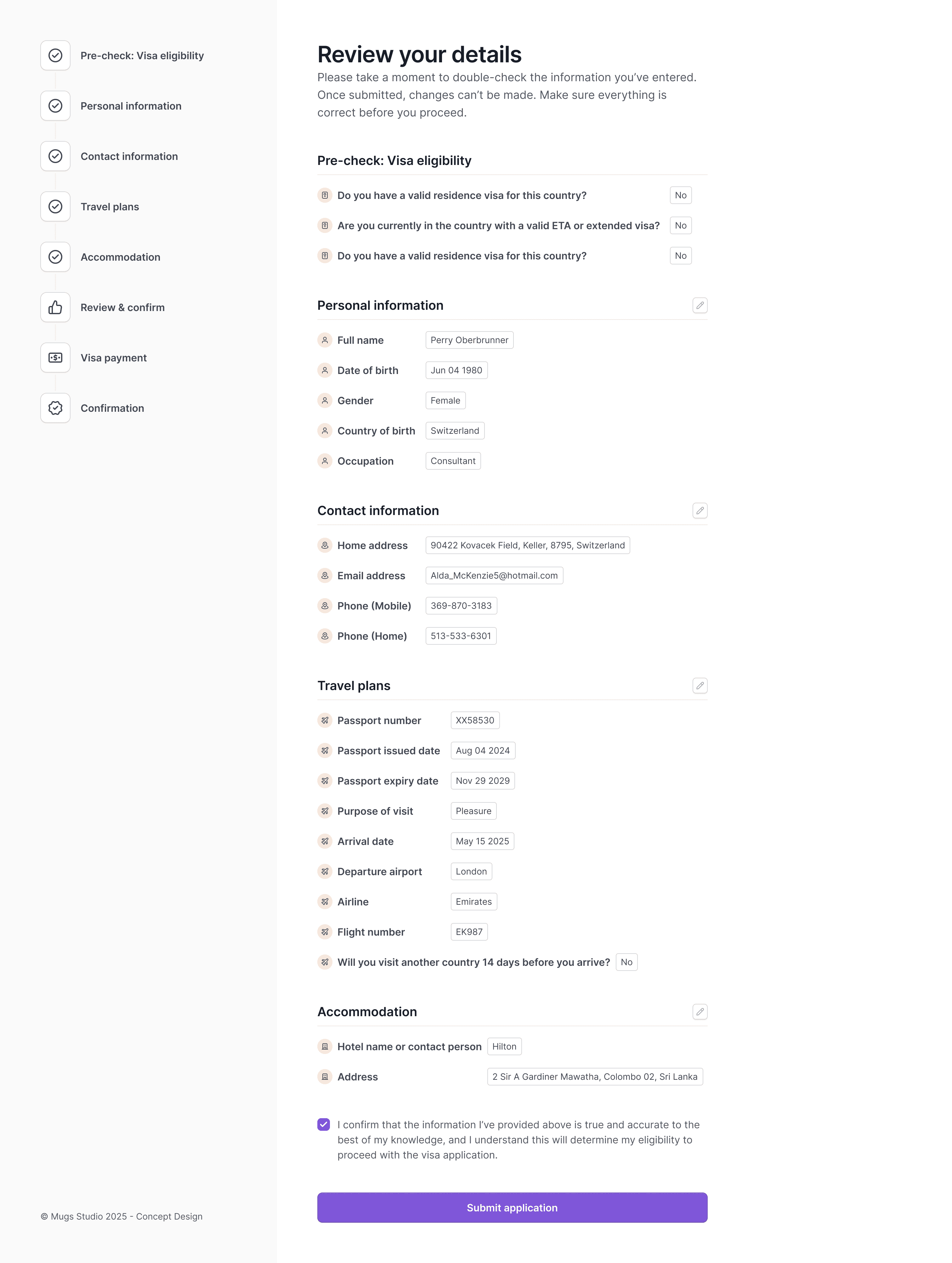
A review screen for users to check and edit information
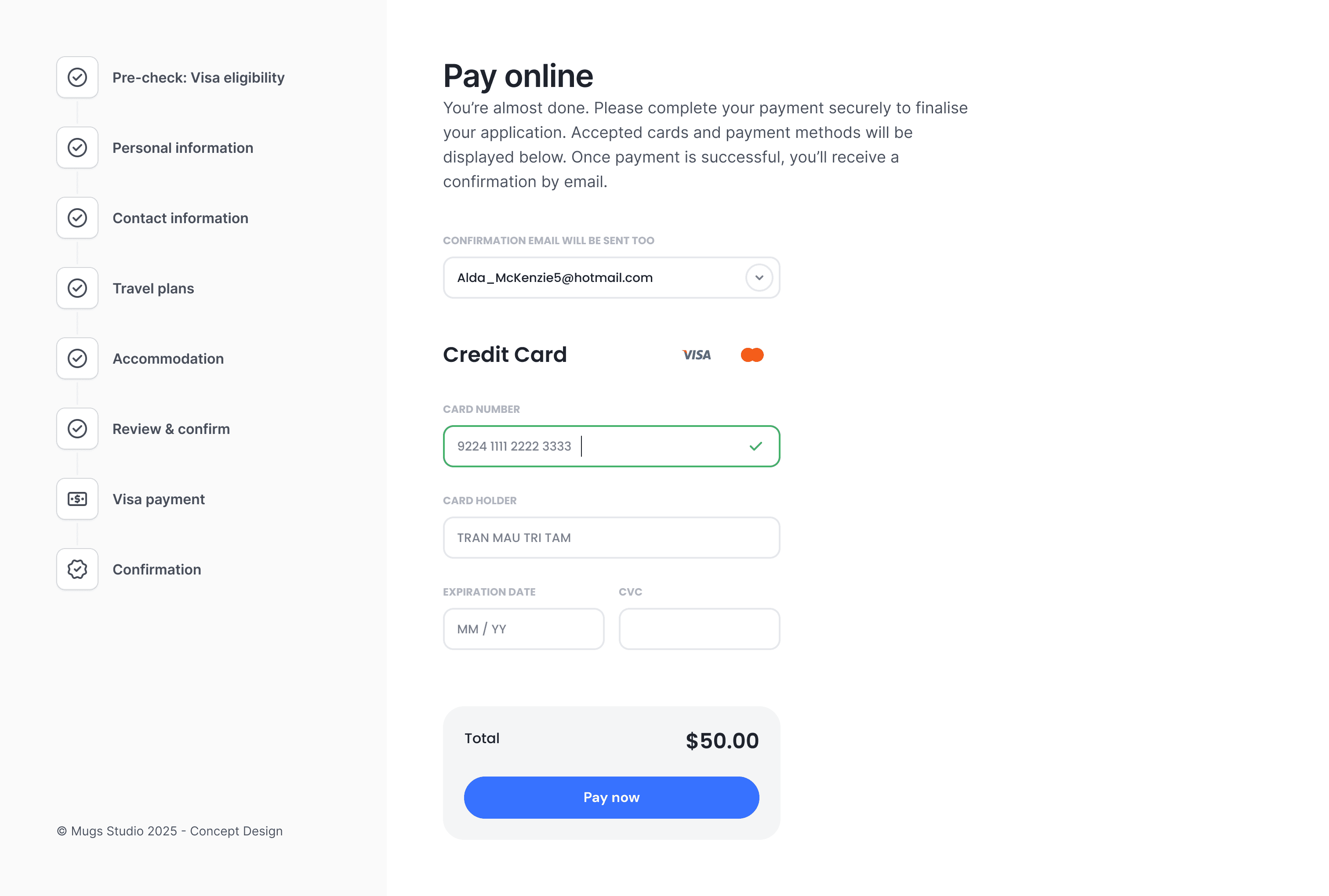
A cleaner, secure payment step with a transparent cost breakdown
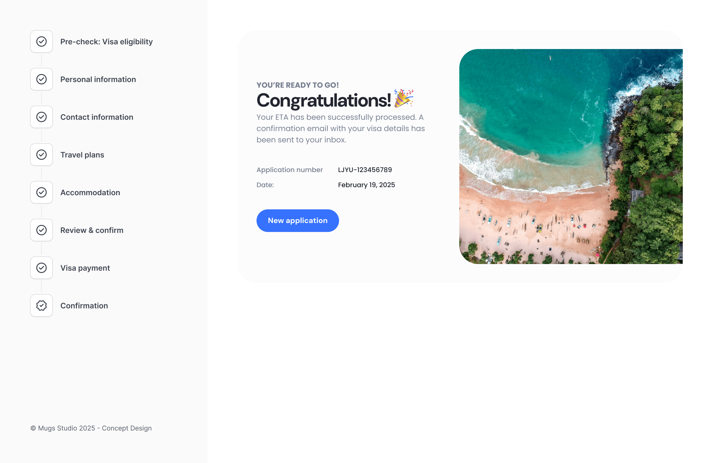
A friendly confirmation page that signals successful completion
This creates a smoother, more trustworthy journey—from first click to final approval.
You might find these helpful
A few related articles that build on what you’ve just read.


