Guides
Why long volunteer forms cause drop-offs and how to fix them
Many volunteer forms ask for too much, too soon. This guide shows how to simplify your sign-up flow so people feel confident, informed, and ready to commit.
Three key methods used in this
guide
When sign-up forms feel harder than the activity itself
Community groups rely on volunteers, yet many sign-up forms unintentionally create barriers. Long fields, early requests for personal information, and unclear expectations often discourage people who want to help. The organisation’s original volunteer form required users to enter everything upfront — from full address to birthdate — before they even saw the available roles or times.

Too many questions before intent is clear
The original form created friction at several points:
Unnecessary details too early — users were asked for full address, birthdate, and lengthy background information before they could even pick a role.
Confusing order of steps — people had to select an activity first, without seeing which dates and times were actually available.
No clarity on commitment — the form didn’t explain how long each role takes, what to expect, or what volunteers needed to bring.
Low trust and low motivation — with no supportive language or reassurance, the form felt like an application, not an invitation to help.
These barriers led to high drop-off rates and fewer volunteers completing the sign-up.
A guided flow that matches how people make decisions
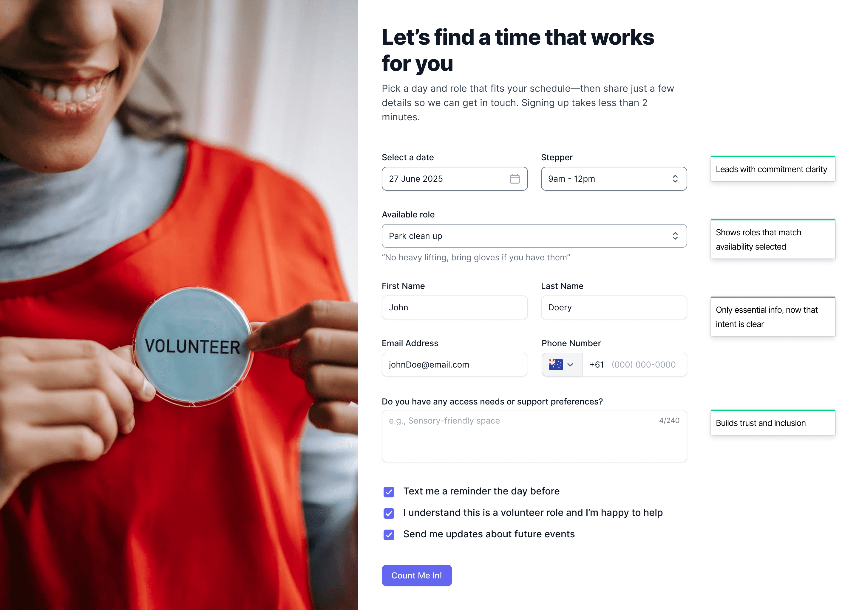
We redesigned the form around clarity, reassurance, and sequencing, helping users commit with confidence.
Intent first, personal details last: Users now start by choosing a date and seeing available roles. Only once they’ve shown intent do we ask for name, email, and phone.
Real-time role filtering: Available roles update based on the date and time selected, removing guesswork and reducing cognitive load.
Clear expectations at the right moment: Helpful microcopy appears contextually:
“Takes less than 2 minutes”
“No heavy lifting, bring gloves if you have them”
This builds trust and sets the right expectations.
Warm, human language: Buttons and labels shift from transactional (“Submit Application”) to welcoming (“Count me in!”), making the experience feel supportive rather than formal.
An optional space for inclusion needs: A short, open-text field encourages accessibility and supports preferences, helping the organisation prepare for every volunteer.

Impact:
Lower abandonment rates
Higher completed sign-ups
A more welcoming experience that reflects the organisation’s values
Volunteers feel informed, respected, and ready to help.
Confusing forms create frustration and unnecessary drop-offs. How do I fix confusing forms? It is a simple resource for spotting where users struggle and making small changes that improve completion rates.
You might find these helpful
A few related articles that build on what you’ve just read.


