Case Studies
-
Streamlining online maintenance requests
Sector:
Public housing
Improving website usability for maintenance
Learn how motivation theory and a research-led redesign transformed a complex maintenance form into a high-confidence digital journey for residents.
Three key methods used in this
case study
User research
Interaction & flow design
content design
The emotional weight of home maintenance
For residents in managed housing, the home is more than just a physical structure; it is the foundation of their safety, health, and dignity. When a critical component of that home, such as a heater in winter, a leaking pipe, or a faulty lock, fails, the impact is felt immediately. The process of requesting a repair is not merely an administrative task; it is a moment of high vulnerability and urgency.
Historically, the primary channel for these requests has been a centralised telephone call centre. While the phone provides a human connection, it also introduces significant barriers. Residents often report waiting on hold for up to an hour, a luxury many people with work or caregiving responsibilities cannot afford. Furthermore, describing a technical problem over the phone can lead to miscommunication, where the true urgency or nature of the issue is lost in translation.
The transition to a digital solution was intended to offer a faster, more reliable alternative. However, a digital portal is only effective if it respects the user’s time and mental state. If the online experience is cluttered, uses confusing technical language, or requires too many clicks, residents will naturally return to the habits they know: the phone. This increases the administrative burden on the housing provider and continues the cycle of frustration for the resident. Our goal was to ensure the digital journey was so intuitive that it became the preferred choice for every resident.
Identifying the friction in the digital journey
To understand why residents were avoiding the existing digital tools, we conducted moderated research sessions across various locations. We sat with residents in community spaces, observing how they interacted with the current system. The findings revealed a deep mismatch between how the system was built and how people actually think about their problems.
The paralysis of choice
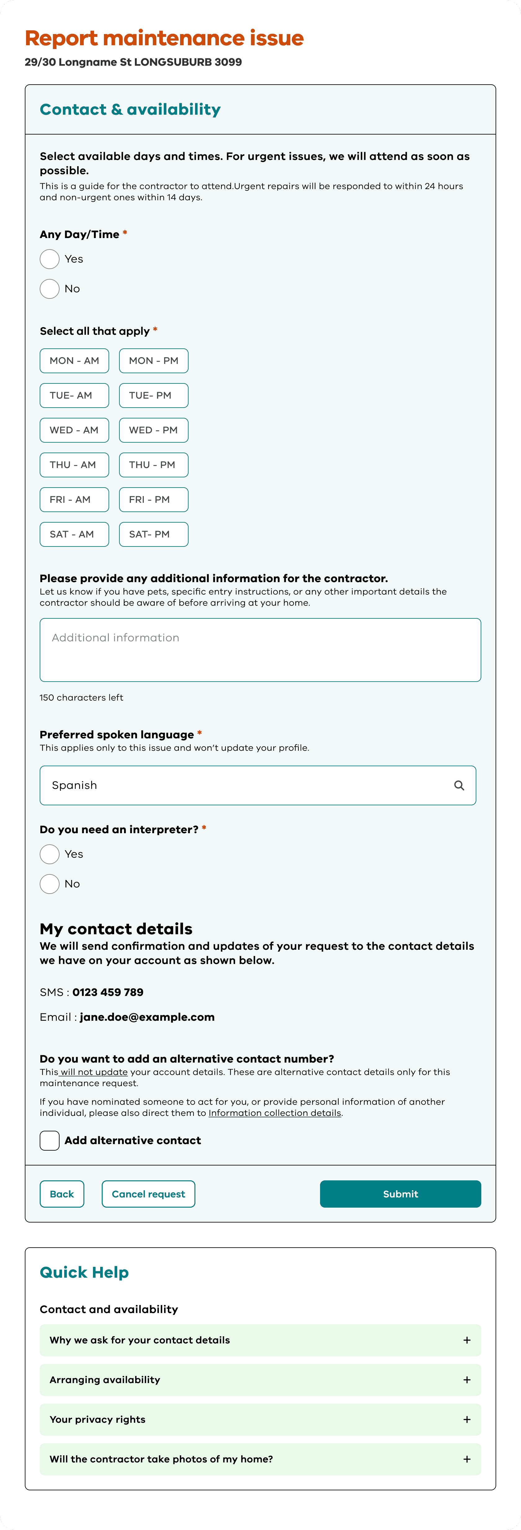
One of the most significant hurdles occurred at the very first step. When asked to identify the location of a repair, users were often met with vague options. For a resident, the distinction between "my home" and a "common area" might seem simple until they are standing in a shared hallway or on a private balcony. The fear of choosing the "wrong" category and having their request rejected or delayed created an immediate sense of anxiety. This hesitation is a primary driver of drop-offs in website usability for public services.
Jargon versus natural language
The initial form design relied heavily on system-centric labels. Residents do not think in terms of "asset categories" or "service codes." They think: “My kitchen tap is dripping" or "the light in the hallway is flickering." When the search function or drop-down menus required them to translate their problem into technical terms, they lost confidence. Many users tried to type their entire problem into a single search box, only to get “no results found,” reinforcing the feeling that the system wasn't built for them.
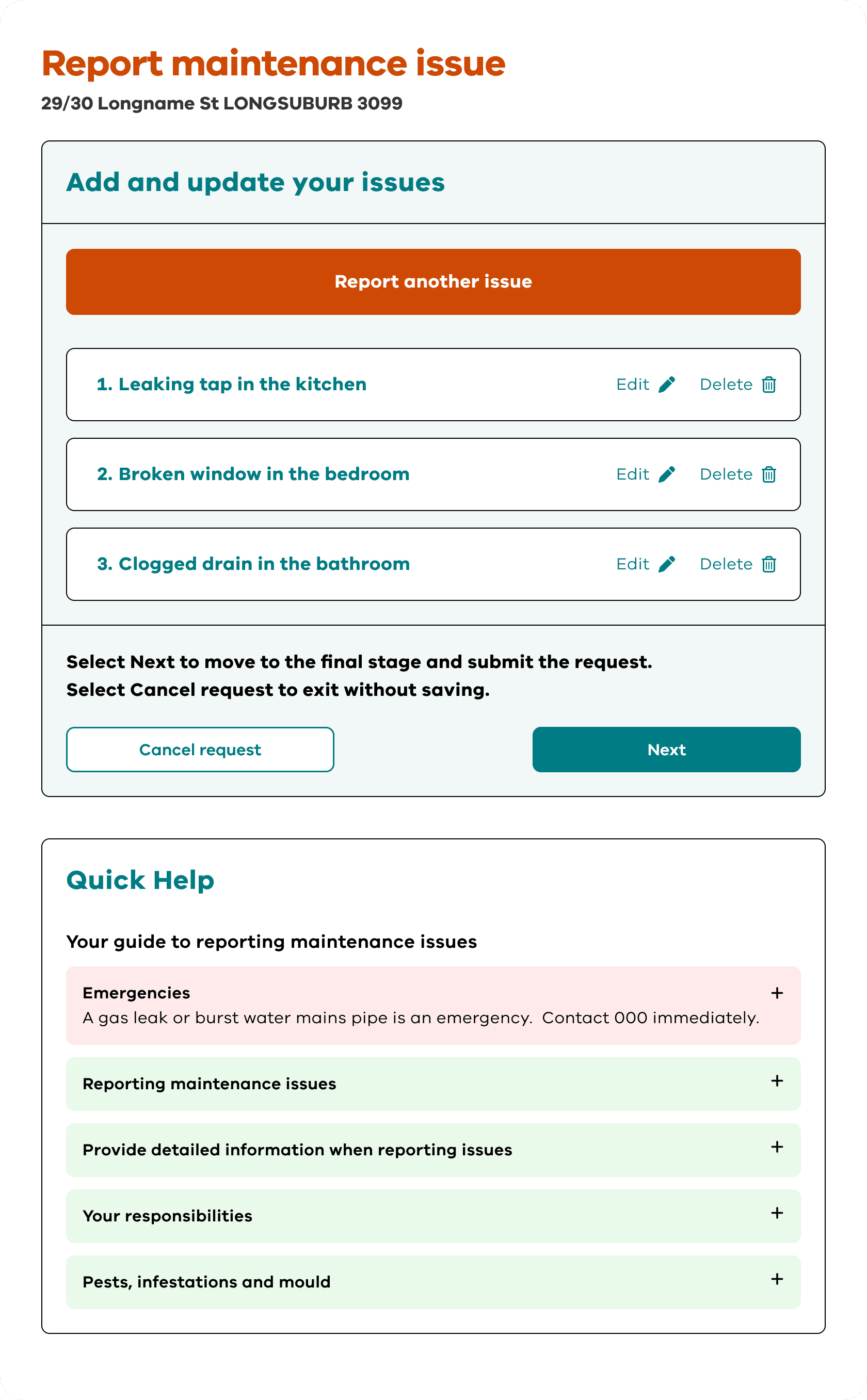
The "black hole" of submission
Submission is the moment of greatest uncertainty. In earlier versions of the original prototype, the final screen offered little more than a generic "thank you" message. Residents expressed a profound lack of trust in this outcome. Without a clear reference number or a visible timeline of "what happens next," they felt as though their request had vanished. This uncertainty often led to "double-handling," where a resident would submit a web form and then immediately call the office to "make sure it went through." For a deeper look into this specific issue, you can explore why online maintenance forms are hard to complete.
A framework for high-confidence reporting
The redesign was not just about changing the interface; it was about changing the user’s psychological experience. We applied Self-Determination Theory (SDT) to frame every design decision. This framework focuses on three core human needs: autonomy (feeling in control), competence (feeling capable), and relatedness (feeling understood by the system).
By simplifying the steps and making the fields "smarter," we reduced the cognitive load and created a guided path from problem to solution.
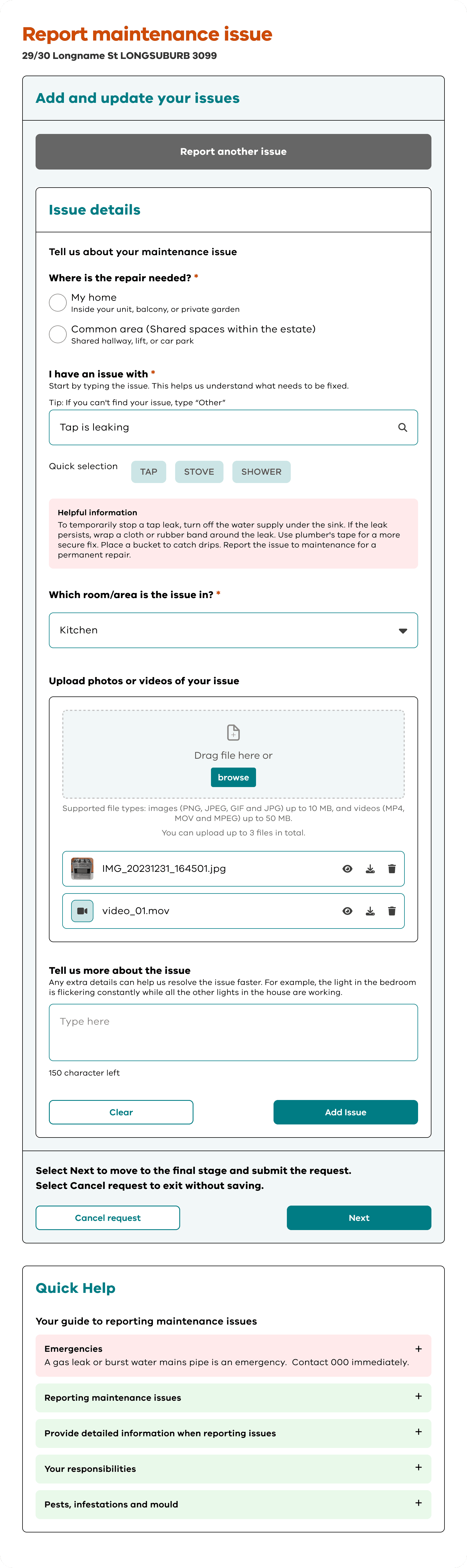
1. Building autonomy through clear starting points
Autonomy begins with clarity. We redesigned the initial "Where is the repair needed?” screen to remove all ambiguity. Instead of a simple list, we provided two distinct paths with explicit, plain-language definitions:
My home: Defined clearly as "Inside your unit, balcony, or private garden."
Common area: Defined as "Shared hallway, lift, stairwell, garden, or car park."
By providing these examples right at the start, we empower the user to make an independent decision with total confidence. They are no longer guessing; they are choosing based on clear information.
2. Enhancing competence with smart search and visual tools
To make the user feel capable, the system must adapt to them, not the other way around. We focused on reducing manual entries and replacing them with intuitive selections.
Predictive search and pills: The “I have an issue with” section now features a smart search bar. As a user types "light," the system suggests common items. Below this, we included "pills" quick-select buttons for the most frequent issues like "tap," “stove,” or “shower.” This allows for a "one-tap" experience for most users.
The fallback mechanism: If the user’s specific issue isn't in the database, we don't stop the journey. A clear link, “I can’t find my issue in the list”, allows them to bypass the search and move directly to a description box. This ensures no one is ever "blocked" by the technology.
Visual confirmation: In the "Tell us more about the issue" step, we simplified the interface to focus on two things: a plain-language description and an image upload. By allowing residents to attach photos, we give them the competence to show exactly what is wrong, which is often easier and more accurate than a written description.
3. Fostering relatedness by acknowledging the social context
Relatedness is the feeling that the system knows who you are and how you live. Our research showed that many requests are made by family members, carers, or neighbours helping someone less tech-savvy.
We introduced a "reporting for someone else" toggle. When activated, it asks for the name of the person living in the home. This small inclusion acknowledges the community-driven nature of social housing. It makes the service feel human and inclusive, rather than a cold, robotic interface.
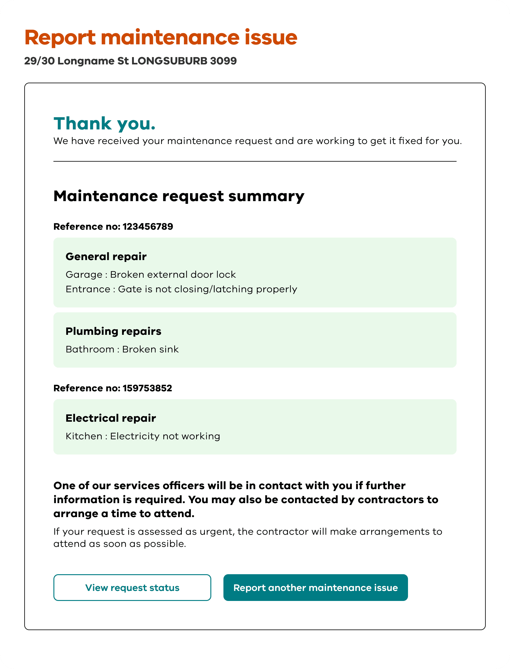
4. Closing the loop with transparent outcomes
The final confirmation screen was redesigned to be a "certificate of completion." Instead of a generic message, the user is met with:
A prominent reference number: This acts as a tangible receipt.
A "What happens next" guide: We explicitly state how long the assessment takes and how the resident will be contacted.
A "View request status" button: This allows the user to track the progress of their repair in real-time. This level of transparency solves the "black hole" problem and provides the emotional reassurance that could previously be found only by speaking to a person on the phone.
Results: Growing adoption and reduced pressure
The redesign’s impact was felt immediately upon launch. By prioritising clarity and the user's mental model, we moved the needle on both efficiency and resident satisfaction.
Immediate reduction in call volumes
In the first week of the launch alone, there was a reduction in maintenance-related phone enquiries compared to the same period in the previous year. This suggests that residents who previously avoided the digital tool now feel confident enough to complete their requests online without needing to call for confirmation.
High digital adoption
The update saw a significant spike in successful form completions. Because the steps were simplified, the rate of people starting and finishing the form in a single session increased by nearly. Residents reported that the form "felt faster" and "made more sense," even though the underlying data requirements remained the same.
A growing trend
Following a successful adoption of the digital reporting tool, it has continued to grow month on month. By making the digital path the path of least resistance, we have not only improved the service's efficiency but also restored a sense of agency to the residents. They are no longer waiting on hold; they are in control of their homes.
You might find these helpful
A few related articles that build on what you’ve just read.