Case Studies
-
How to simplify complex safety data?
Sector:
Real estate & public safety
Timeline:
8 Weeks
Optimising the app user experience for suburb safety
Discover how we designed a mobile app concept to clarify record-high crime data, focusing on creating a seamless user experience for property seekers.
Three key methods used in this
case study
User research
Interaction & flow design
visual design
Addressing the safety gap in the 2025 property market
The Australian property landscape in 2025 has become increasingly difficult to navigate. Beyond the challenges of rising interest rates and low rental vacancy, a new concern has moved to the forefront of public consciousness: personal and property safety. With crime rates reaching record highs throughout the year and into the present day, the emotional weight of choosing a new home has intensified.
For many Australians, the question is no longer just about the number of bathrooms or proximity to local schools. The primary concern now is the long-term safety of their families and assets. However, finding reliable information is a challenge. While raw data exists within various government and police databases, it is rarely presented in a way that is accessible or mobile-friendly.
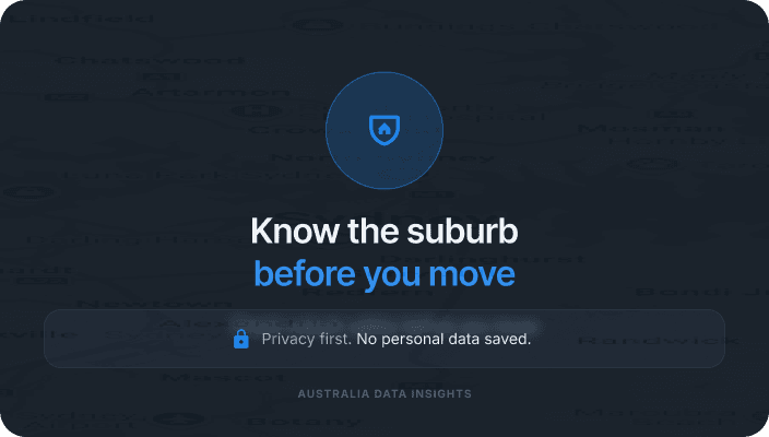
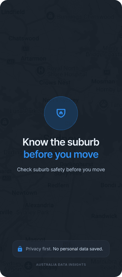
The "Suburb check" app concept was designed in Figma to bridge this gap. We set out to create a digital tool that takes complex, overwhelming safety statistics and transforms them into clear, actionable insights on a mobile screen. By focusing on empathy and clarity, we aimed to provide a benchmark for how high-stakes information should be communicated in a modern user experience. The project serves as an exploration of how thoughtful design can empower users during a period of significant social and economic uncertainty.
The anxiety of the unknown and the failure of data clarity
When crime is a consistent headline, it creates a general sense of unease that impacts how people view every suburb. During our research phase, we identified that the problem isn't a lack of data, but rather a lack of meaningful context within existing digital interfaces. Users are currently forced to navigate several significant obstacles when trying to determine if a suburb is safe to move into.
The paralysis of raw statistics
Most safety information is presented as total incident counts. Seeing a figure like "4,500 offences" for a large suburb like Wollert can be terrifying for a potential resident. However, without knowing the population density or the specific nature of those offences, the number is meaningless. Users find themselves in a state of "analysis paralysis," unable to distinguish between a suburb with high commercial theft at a shopping centre and one with high residential break-ins on quiet streets.
Information overload on mobile devices
The most critical time for a property seeker to access safety data is while they are out visiting properties. Unfortunately, existing public data sources are almost never optimised for mobile use. They often feature clunky interfaces, tiny text, and slow loading times that make them impossible to use while standing on a footpath or waiting at an open-for-inspection. This friction often leads users to abandon official data and rely on anecdotal evidence from social media, which is frequently exaggerated or inaccurate.
The fear factor in visual design
Many existing platforms that handle "crime data" use aggressive visual cues, bright reds, police tape motifs, and alarming icons. In an environment where crime has reached record highs, this type of design only serves to increase user anxiety. People are already worried; they don't need a tool that makes them feel like they are entering a danger zone. There is a desperate need for a calmer, more analytical environment where users can process difficult facts without feeling overwhelmed.
The disconnect between trends and current reality
Crime is not static. A suburb that was safe three years ago might be experiencing a current spike, or a historically "rough" area might be seeing a steady decline in incidents. Most tools provide a snapshot of the past year but fail to show the ongoing trend. This leaves users asking, "Is the crime situation getting better or worse right now?" Without trend data, buyers and renters cannot assess the future risk of their investment.
A design-led approach to safety insights
Our solution for the "Suburb check" concept prioritised the user's emotional state, ensuring that the app interface provides clarity and reassurance rather than confusion. We used Figma to build a prototype that demonstrates how to handle sensitive data with care and precision.
Establishing trust with a privacy-first approach
One of the first decisions we made was to ensure the app felt safe to use. We implemented a "no personal data" policy, clearly stating on the landing screen that searches are private and no information is stored. This immediately lowers the barrier to entry. If a user is worried about their privacy being compromised while searching for a new home, they won't engage with the product. By removing the need for a login, we allow the user to get straight to the information they need.
Translating numbers into risk likelihood
To solve the problem of abstract statistics, we introduced a "Risk Likelihood" feature. Instead of showing a percentage or a raw count, the app shows the statistical probability of an incident occurring. For example, rather than saying "2%," the UI might state that there is a "1 in 50 chance per year of property crime." This makes the information relatable and easier to digest. It helps the user understand that, while crime might be high in 2025, the actual likelihood of being personally affected can still be put into a manageable perspective.
Visualising the ongoing trend
Given that crime has reached record peaks, we prioritised trend visualisation. We included sparklines and line charts that show the five-year trajectory of different crime categories. This allows a user to see if a current spike is a temporary anomaly or part of a consistent upward trend. By categorising incidents into "Property," "Personal," and "Public Order," we help the user see exactly what is changing in the suburb. A renter might be less concerned about a rise in public order incidents near a nightlife hub but highly concerned about an increase in residential theft.
Optimising the search for the "on-the-go" user
The mobile interface was built for speed. We used a "Safety Snapshot" card that appears immediately after a suburb is searched. This card provides the most important information—the overall safety rank and the top three crime drivers—in a high-contrast, easy-to-read format. This ensures that even if a user has only 30 seconds before their property inspection begins, they can get a clear sense of the area's safety profile.
Encouraging informed comparisons
Choosing a suburb is often about trade-offs. We designed a "Compare" tool that allows users to benchmark a suburb like Wollert against state averages or neighbouring areas. This visual benchmarking is essential for a better user experience because it provides the necessary context for the data. Seeing that a suburb's crime rate is "High" compared to the state average, but "Lower" than a nearby alternative, helps the user make a more nuanced and less fearful decision.
Closing the loop with practical action
We didn't want the user to leave the app feeling anxious. At the bottom of every suburb report, we included a section for "Safe Living Tips." These are practical, non-alarmist suggestions, such as checking the lighting on a street or joining a local community group. This shifts the user's mindset from passive concern to active preparation, ending the digital journey on a constructive note.
Disclaimer: Conceptual design and placeholder data
Please note that the "Suburb check" project described below is an app concept developed for design demonstration purposes. All safety figures, crime statistics, and location details used in the mockups are sample data intended as placeholders. This information is not an accurate representation of real-world crime metrics and should not be used to make actual property or relocation decisions.
You might find these helpful
A few related articles that build on what you’ve just read.


