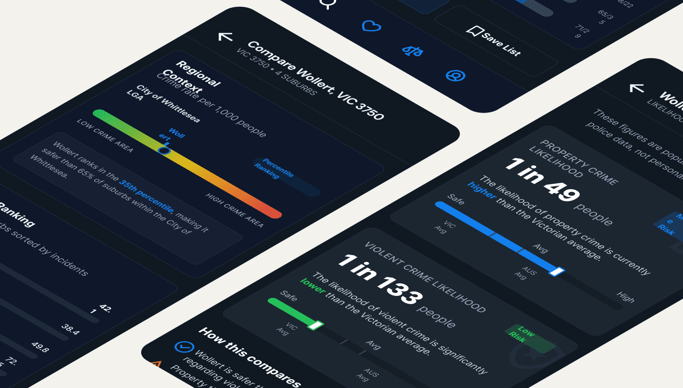
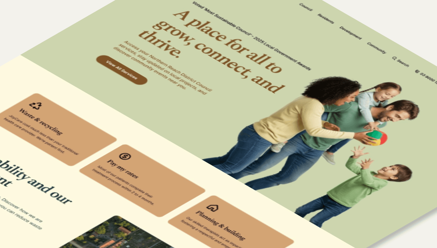
Confusing online tasks stop people from getting support.
I design clear, accessible digital tools for public and not-for-profit teams, so things like applying, booking, or reporting can be done without frustration.
Currently fully booked until June
Open to chat for future work
Currently fully booked until June
Open to chat for future work
Currently fully booked until June
Open to chat for future work
Laws of UX
Choice overload
The tendency for people to get overwhelmed when they are presented with a large number of options, often used interchangeably with the term paradox of choice.
Laws of UX
Choice overload
The tendency for people to get overwhelmed when they are presented with a large number of options, often used interchangeably with the term paradox of choice.
Laws of UX
Choice overload
The tendency for people to get overwhelmed when they are presented with a large number of options, often used interchangeably with the term paradox of choice.
Common service pain points and how UX can help
Practical examples of where digital services fall short—and small UX changes that can improve access, usability, and trust.
Accessibility is still an afterthought
Many platforms exclude users with disabilities, leading to non-compliance and public mistrust.
Action
Run an accessibility audit and redesign key flows to meet WCAG 2.1 AA standards.
Clunky, confusing user interfaces
Outdated systems make tasks hard to complete, especially for vulnerable or time-poor users.
Action
Rework navigation and form structures to reduce steps and simplify tasks.
Low engagement with public services
Critical services are underused not because of lack of need but because of poor online experiences.
Action
Introduce behaviourally informed design patterns that guide users to take action.
Language and cultural barriers
Poor multilingual support limits access for culturally and linguistically diverse communities.
Action
Integrate professionally translated content and build language toggles into the UI.
Information overload
Pages are packed with jargon or too much content—users don’t know where to start.
Action
Rewrite content using plain language and design content blocks for easy scanning.
Fragmented service delivery
Disconnected tools and processes force users to repeat steps or drop out.
Action
Map user journeys to identify overlaps and unify steps into one streamlined flow.
No feedback loops after launch
Many digital services stay static—no one measures what’s working or what’s not.
Action
Set up user testing and analytics to gather real feedback and drive improvements.
Mobile experiences are poor or ignored
Users in remote or low-income areas often rely solely on phones, but the UI doesn’t support it.
Action
Optimise layout, tap targets, and load times for mobile-first usability.
Donations and support are lost to friction
Not-for-profit websites often bury or complicate donation flows.
Action
Redesign the donation journey to be visible, fast, and low-effort with fewer fields.
Stakeholders undervalue design
Design is treated as decoration rather than a tool for social impact.
Action
Run a discovery workshop that links service delivery goals with design impact metrics.
Empower public sector and not-for-profit services through accessible, outcome-driven UI/UX.
UI/UX isn’t just design—it’s a business tool. At Mugs Studio, we leverage research, design, and strategy to transform digital products into high-performing assets that enhance engagement, understanding and long-term growth.
Value propositions of UI/UX
Benefits
Benefits
Benefits
The key ways human-centred design improves services, reduces costs, and delivers better outcomes:
Confident, satisfied users
WCAG-compliant accessibility
Fewer support calls, less admin
Faster digital service rollout
Greater public trust
More service re-use
Smarter, data-led decisions
Scalable design systems
Better engagement from all communities
Aligned with digital standards
Laws of UX
Von restorff effect
The Von Restorff effect, also known as The Isolation Effect, predicts that when multiple similar objects are present, the one that differs from the rest is most likely to be remembered.
Laws of UX
Von restorff effect
The Von Restorff effect, also known as The Isolation Effect, predicts that when multiple similar objects are present, the one that differs from the rest is most likely to be remembered.
Laws of UX
Von restorff effect
The Von Restorff effect, also known as The Isolation Effect, predicts that when multiple similar objects are present, the one that differs from the rest is most likely to be remembered.


I’ve worked extensively across the public and not-for-profit sectors, contributing to digital projects for organisations like Life Saving Victoria, the Department of Families, Fairness and Housing (DFFH), and the Department of Health. These collaborations have shaped my approach to inclusive, accessible, and outcome-driven design, ensuring digital tools meet the needs of all users, especially in essential community services.
Mugunthan Balakrishnan
UI/UX Consultant
Our UX Services Snapshot
We audit and improve digital services for public sector and not-for-profit teams—making them easier, clearer, and more accessible.
UI/UX Consultancy
Expert support to plan, design, and improve digital services—so they’re easier to use, more accessible, and aligned with real community needs.
Product Audits & Reviews
Check how well your digital service works for real people—then get simple, clear steps to make it easier, faster, and more inclusive.
Laws of UX
Cognitive load
The mental resources required to understand and engage with an interface.
Laws of UX
Cognitive load
The mental resources required to understand and engage with an interface.
Laws of UX
Cognitive load
The mental resources required to understand and engage with an interface.