Guides
How do you make donation prompts clearer and more accessible?
Many donation prompts fail because the message is hard to read or lacks clear intent. This redesign shows how accessible content and structure can boost clarity and action.
Three key methods used in this
guide
Why accessibility in donation appeals matters
Donation prompts are often the first moment where supporters decide whether to act. But many prompts unintentionally exclude users by relying on low contrast, unclear messaging, or visuals that overpower the call to donate. When the design isn’t accessible, users with visual, cognitive, or motor impairments struggle to understand the message — and many move on.
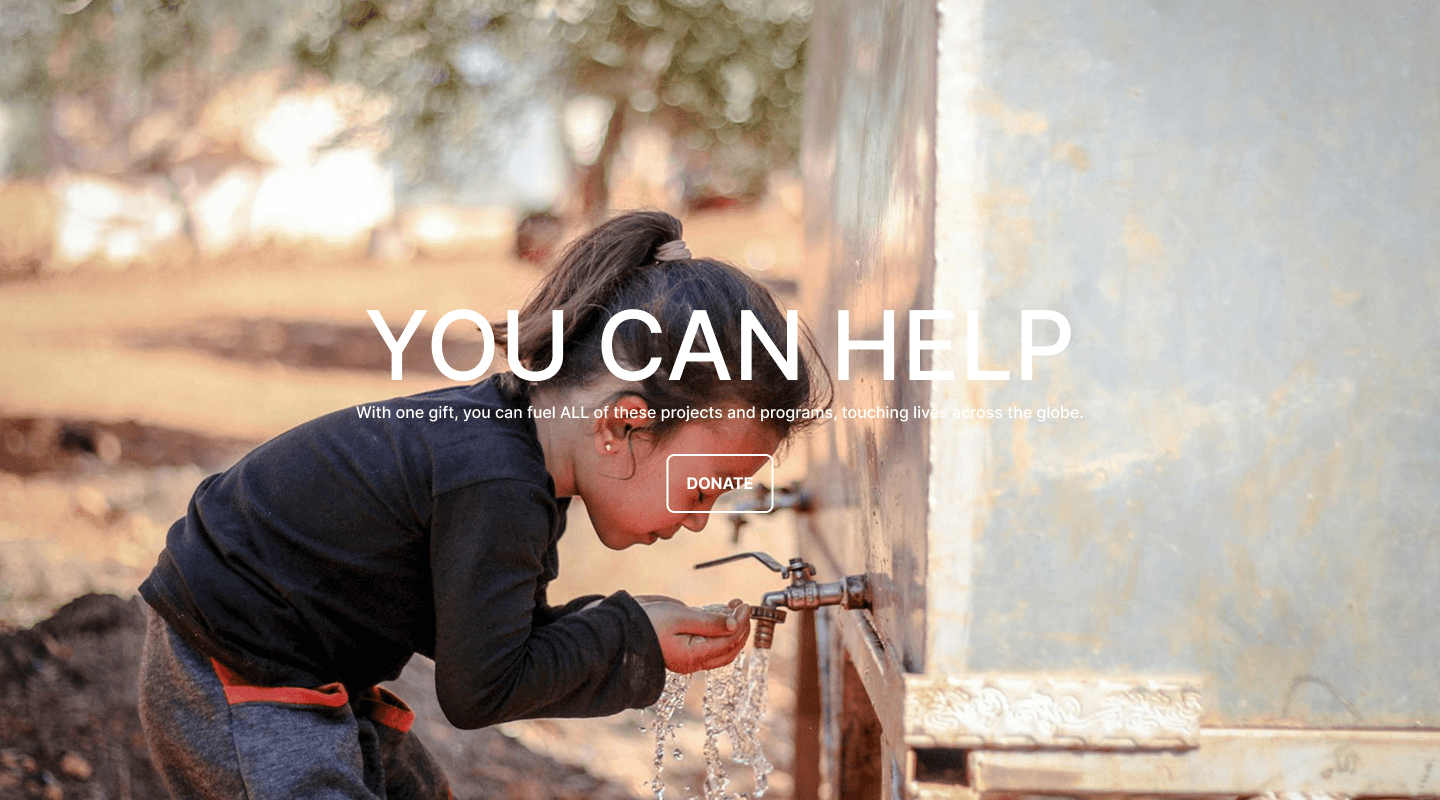
When design gets in the way of giving
In the original layout, the key message was buried under a busy background image, making it hard to read or understand. The headline was generic and lacked meaning, offering no context about why the donation mattered.
Other issues included:
Low-contrast subtext that blended into the image
A donate button with little visual weight and no accessible labelling
A layout with no separation of content, causing cognitive overload
Poor structure for screen readers, leaving users unsure of purpose or impact
These barriers made it harder for people to trust the message — and harder for them to take action.
A clearer, accessible design that supports every donor
The improved version restructures the entire prompt so users can read, understand, and act without friction. The image and message are separated, allowing the content to stand on its own. Contrast meets WCAG standards, ensuring the headline and subtext are clear for all users.
Key improvements include:
A contextual headline that links donation to real impact
High-contrast, readable text on a clean background
A strong, purpose-driven CTA with supportive microcopy
A layout that reduces overwhelm and guides users step by step
Better accessibility for people using assistive technologies
With these changes, the donation prompt becomes more trustworthy, more inclusive, and more likely to inspire action.

You might find these helpful
A few related articles that build on what you’ve just read.