Insights
-
Why do users quit forms?
Sector:
Healthcare
Why do people quit your online forms and how do you fix it?
Learn why users abandon forms and how clear labels, grouped fields, helpful errors, and better structure reduce frustration and increase completion rates.
Three key methods used in this
insight
Interaction & flow design
content design
Usability testing
Online forms fail when they expect users to guess
Forms are often the quiet cause of lost bookings, payments, and sign-ups. When fields are vague, instructions are missing, or the layout feels scattered, people lose confidence quickly.
What seems like a small inconvenience to a team — such as unclear labels or a confusing sequence — becomes a barrier that stops users from completing the task.
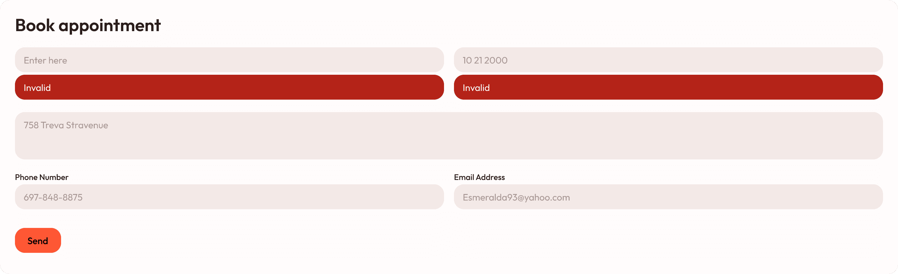
Unclear labels and unhelpful errors push people away
In many real-world cases, users try to complete a form but receive vague or unfixable messages like “Invalid” or “Error”.
They’re given no guidance about what went wrong, fields are spread out, and information is asked for in an illogical order.
Common issues include:
Labels that don’t explain what is needed
Errors that don’t tell users how to fix the problem
Contact details and address fields scattered randomly
Forms clearing if users take too long
This creates frustration and leads to quick abandonment — especially for tasks like bookings, sign-ups, or applications.
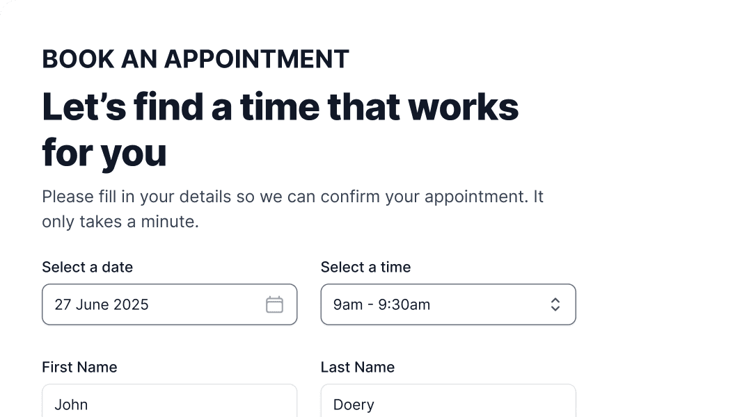
Clear labels, grouped fields, and human guidance
A well-designed form guides people step by step.
Each field is clearly labelled (“Full name”, “Date of birth”), error messages explain what to do next, and related fields are grouped so the form flows naturally.
Helpful improvements include:
Clear, descriptive labels for every field
Human-friendly error messages explaining how to fix issues
Logical grouping of related information
Reasonable session time limits to avoid clearing data
With these changes, users complete forms smoothly, support teams receive fewer calls, and online conversions improve.
If users get stuck or give up halfway through a form, it’s usually a sign that the flow isn’t clear. How do I fix confusing forms? Breaks down the common issues and shows practical ways to make forms easier to complete.

You might find these helpful
A few related articles that build on what you’ve just read.


